


The number-one reason website projects stall? It's not technical problems. It's not scope changes. It's that the brand identity checklist wasn't sorted before the build started.
We see it constantly. A Singapore startup reaches out wanting a website built. They've got funding, they've got a product, they're ready to launch. Then we ask for their logo files. "We're still working on it." Colour palette? "We'll figure it out during design." Brand voice? Blank stares.
What follows is three to six weeks of delays while branding decisions get made under pressure, with a web designer waiting and a launch date slipping. The website ends up costing more. The brand ends up inconsistent. Everyone's frustrated.
This post is the checklist we send every new client before a project kicks off. If you're a Singapore startup planning to build a website in the next six months, work through this list first. You'll save yourself time, money, and the pain of a mid-project identity crisis.
Why branding comes before your website: not during
Your website is the single biggest expression of your brand. Every colour, every font choice, every word on the page communicates who you are to potential customers. Building a website without a clear brand identity is like furnishing a house before the walls are up.
When branding decisions happen mid-project, here's what goes wrong:
- Design revisions multiply. The designer creates a homepage based on "we like blue," then the founder changes their mind to teal, then the co-founder suggests purple. Each change cascades through every page.
- Timelines stretch. A three-week website build becomes seven weeks because two of those weeks are spent debating logo placement and colour combinations.
- Costs increase. Every revision round costs time. Some agencies bill for it; others absorb it and quietly resent the project. Neither outcome is ideal.
- Consistency suffers. When decisions are rushed, your website says one thing, your business cards say another, and your social media profiles look like they belong to three different companies.
Research consistently shows that consistent brand presentation across platforms can increase revenue by up to 23%. That consistency starts with having your identity locked in before any design work begins.
For a deeper look at what goes into brand strategy, our branding guide for Singapore SMEs covers the full picture.
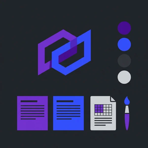
The brand identity checklist for Singapore startups
Here's the complete list. Every item below should be finalised and documented before your web designer opens their design tool. We'll break each one down in the sections that follow.
- Logo: primary version, variants, and all necessary file formats
- Colour palette: primary, secondary, and accent colours with exact hex codes
- Typography: heading and body fonts selected and tested for web use
- Brand voice and tone: how your brand speaks, documented with examples
- Tagline and value proposition: one sentence that tells visitors what you do and why they should care
- Target audience definition: who you're building this website for, specifically
Miss any of these and your web designer will either make assumptions on your behalf (risky) or come back to you with questions that stall the project (slow). Neither is what you want.
Logo: what "done" actually looks like
Having a logo is not the same as having a web-ready logo. We've received logos as blurry JPEGs pulled from WhatsApp, as PowerPoint slides, and once as a photo of a business card taken on a phone. None of those are usable for a website build.
Here's what your designer actually needs:
File formats:
- SVG: vector format that scales to any size without losing quality. This is the format your web designer will use most. Non-negotiable.
- PNG with transparent background: for situations where SVG isn't supported. Minimum 1000px wide.
- Favicon version: a simplified icon that works at 32x32 pixels and 16x16 pixels. If your logo has fine detail or small text, the favicon needs to be a stripped-down version.
Logo variants you need:
- Primary logo: the full version with icon and wordmark
- Icon only: for favicons, app icons, social media profile pictures, and small spaces
- Light background version: typically your standard logo in full colour
- Dark background version: white or light-coloured variant. If your logo uses dark colours, it vanishes on a dark header or footer.
- Monochrome version: single-colour versions (black and white) for contexts where colour isn't available
When we built the brand identity for Kingsman & Associates, the logo needed to work on both a dark premium website header and light-coloured corporate documents. Without both variants prepared upfront, the design would have stalled at the header stage.
If you don't have a logo yet, or yours needs updating, our guide to logo design costs in Singapore breaks down what you should expect to pay at every budget level.
Recommended reads
Colour palette: more than picking colours you like
Choosing brand colours based purely on personal preference is a trap. "I like green" is not a colour strategy. Your palette needs to work across screens, print, and physical materials, and it needs to communicate the right things to your specific audience.
A complete brand colour palette for web includes:
- Primary colour: the dominant colour that represents your brand. This appears in your header, buttons, and key calls-to-action. Define it with exact hex codes (e.g. #7a00df), not "purple."
- Secondary colour: complements the primary and provides visual variety. Used for backgrounds, secondary buttons, and accents.
- Accent colour: draws attention to specific elements. Often used sparingly for highlights, links, or notification states.
- Neutral tones: background whites/greys, text colours, border colours. These do the quiet work of making your site readable.
Accessibility matters more than you think. Your text must have sufficient contrast against its background to be readable by everyone, including the roughly 8% of men who have some form of colour vision deficiency. The WCAG AA standard requires a minimum contrast ratio of 4.5:1 for body text and 3:1 for large text. That crisp light-grey-on-white look might seem elegant, but if it fails contrast checks, it's excluding potential customers.
Cultural considerations in Singapore and Southeast Asia. Colour carries different weight across cultures. Red signals prosperity and good fortune in Chinese culture, useful for businesses targeting a Chinese Singaporean audience. White, associated with funerals in parts of East Asian culture, needs careful handling. Gold communicates premium quality across most Asian markets. None of this means you need to build your palette around cultural symbolism, but being aware of these associations prevents missteps.
When we worked on G&K Couture's website, the cream-and-gold palette wasn't arbitrary. It was chosen specifically to communicate luxury craftsmanship to an audience that values traditional Chinese artistry. The colours did half the persuading before a single word was read.
Typography: choosing fonts that actually work on the web
Fonts are one of those things that people notice when they're wrong and take for granted when they're right. Picking the wrong typeface (or pairing two fonts that clash) makes a website feel amateur even if everything else is polished.
Here's what to decide before your website build:
Heading font. This is your display typeface: used for page titles, section headings, and hero text. It carries more personality. Bolder, more distinctive choices work here because headings are short.
Body font. This is your workhorse: paragraphs, lists, descriptions, and everything your visitors actually read. Readability is the priority. Clean, well-spaced sans-serif fonts like Inter, Open Sans, or Source Sans Pro perform well across devices and screen sizes.
Font pairing rules that work:
- Pair a serif heading font with a sans-serif body font (classic, reliable)
- Pair two fonts from the same type family but different weights (consistent, modern)
- Never use more than two (at most three) typefaces on a website. More than that creates visual noise.
Use Google Fonts. They're free, they're optimised for web performance, and they render consistently across browsers and devices. Custom fonts look beautiful in a brand guide PDF, but if they add 300KB to every page load and render differently on Android versus iOS, they're hurting more than helping.
Test on mobile. Pull up your chosen fonts on a phone screen at body-text size (16px). If the letterforms are cramped, the spacing is tight, or it's tiring to read after two paragraphs, pick something else. Over 70% of web traffic in Singapore comes from mobile devices. That's where readability matters most.
Brand voice, messaging, and value proposition
Your brand voice isn't just marketing jargon; it directly shapes every word on your website. And if that voice isn't defined before the copywriting starts, your website ends up sounding like it was written by five different people (because it probably was).
At minimum, define these three things:
1. Tone of voice. Is your brand formal or conversational? Technical or plain-spoken? Playful or authoritative? Write it down with specific examples. "Professional but approachable" means nothing without showing what that looks like in practice. Instead, write: "We say 'Let's talk about your project' not 'Submit an enquiry via our contact form.'"
2. Value proposition. One sentence that answers: what do you do, who is it for, and why should they choose you over the alternatives? This sentence will likely appear in your website hero section, your Google Business Profile description, and your meta description. Get it right, and your designer and copywriter have a north star. Leave it vague, and every page will feel slightly off.
3. Key messages. Three to five points you want every website visitor to walk away understanding. These feed directly into your homepage structure, your about page, and your service descriptions. Without them, web copy tends to ramble, saying everything and communicating nothing.
Don't overthink this step, but don't skip it either. Even a one-page document covering tone, value proposition, and three key messages gives your web team enough to build something cohesive.
Know your audience. Before you can define how to speak, you need to know who you're speaking to. A B2B SaaS startup targeting CTOs in Singapore writes very differently from a boutique bakery targeting young families. Document your primary audience: their age range, pain points, what they're searching for, and what objections they'll have. This feeds into every design and copy decision your web team will make.
When to invest in professional branding versus doing it yourself
Not every startup needs to spend thousands on a brand identity agency. But some absolutely should. Here's how to decide.
DIY is fine if:
- You're pre-revenue and still validating your business model
- Your brand will likely evolve significantly in the next 12 months
- You have a good eye for design and are willing to learn the fundamentals
- Your industry doesn't rely heavily on perceived prestige (e.g. you're selling a software tool, not luxury goods)
Hire a professional if:
- You have paying customers and your brand is your first impression with new prospects
- You're in a competitive market where credibility matters: finance, healthcare, legal, luxury
- You're investing in a website that needs to generate leads or sales from day one
- You have multiple co-founders or stakeholders with different aesthetic preferences (a professional provides an objective framework)
A practical middle ground: get your logo professionally designed (SGD 500–1,500 buys solid work in Singapore) and handle the rest (colour palette, font selection, brand voice) yourself using free tools and the guidance in this checklist. Then, as revenue grows, invest in a comprehensive brand guide.
Our logo design cost guide breaks down exactly what you'll get at each price point. And if you're ready for the full package, our branding service covers everything from discovery to a complete brand guidelines document.
Putting it all together: your pre-website brand kit
Before your first design meeting, assemble everything into a single document or folder. Here's the final checklist in one place:
- Logo files: SVG (vector), PNG (transparent, min. 1000px wide), favicon (32x32), dark background variant, icon-only version
- Colour palette: primary, secondary, accent, and neutral colours with hex codes. Confirm all text/background combinations meet WCAG AA contrast ratios.
- Typography: heading font and body font named explicitly (e.g. "Poppins Bold for headings, Open Sans Regular for body text"). Include fallback fonts.
- Brand voice document: tone description with examples, value proposition (one sentence), and 3–5 key messages
- Target audience profile: who they are, what they need, what they're searching for online
- Visual references: 3–5 websites or brands whose look and feel aligns with your vision. This gives your designer a starting point that's far more useful than abstract adjectives like "modern" or "clean."
Share this kit with your web designer before the project begins. Not during the first meeting, before. It lets them come prepared with informed questions and initial concepts that are actually relevant, rather than generic mockups they have to redo once they understand your brand.
The difference between a website project that takes three weeks and one that drags on for three months often comes down to this: was the brand ready?
Building a website without a brand identity checklist is the most expensive shortcut a Singapore startup can take. It feels faster (skip the branding, jump straight to design), but it almost always costs more in revisions, delays, and a final product that doesn't feel cohesive.
Work through this checklist before your next web project. Get your logo files sorted. Lock in your colours with proper hex codes. Choose your fonts and test them on mobile. Write down how your brand sounds. Define who you're speaking to. Package it up and hand it to your web designer on day one.
If you need help pulling your brand identity together, or you're ready to move from brand kit to live website, explore our branding service or get in touch for a free consultation. We've helped over 100 Singapore businesses go from scattered brand elements to polished, consistent identities that work across every touchpoint.

Written by
Terris
Founder & Lead Strategist
Terris has over 8 years of experience in web design, development, and digital marketing. He has helped more than 100 Singapore businesses build powerful online presences that drive measurable results.
Want to see these strategies in action? Browse our portfolio or get in touch to discuss your project.