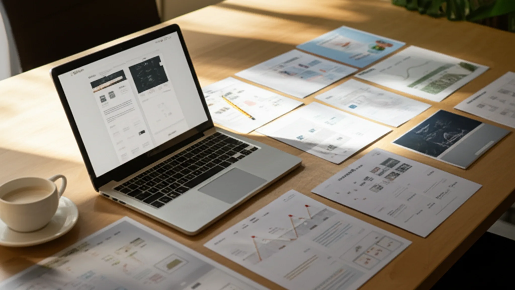


You're about to hire a web designer. You've shortlisted three or four candidates, and you're looking at their portfolios. The designs look nice. The screenshots are polished. But how do you actually tell whether this person can build a website that works for your business?
Here's the problem: most people judge a web design portfolio the same way they judge art. They look at it, decide if it's pretty, and move on. But a website is not a painting. It needs to load fast, work on phones, rank on Google, convert visitors into customers, and be easy for you to update after launch. A pretty screenshot tells you almost nothing about any of those things.
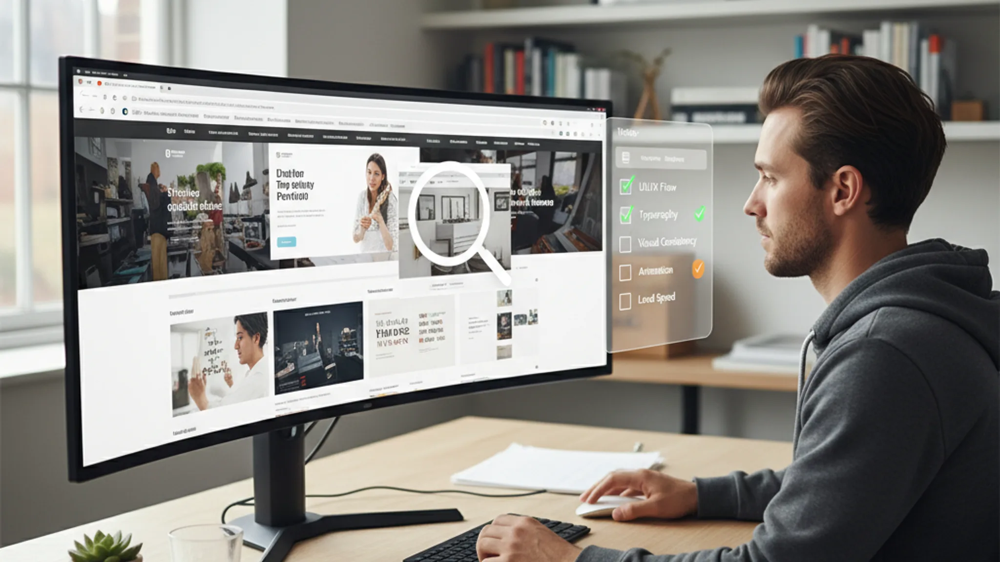
This guide covers the 11 things to check in a web design portfolio before you sign anything. Each checkpoint goes beyond surface-level aesthetics and tells you something meaningful about how the designer works and what kind of results you can expect.
- Are the portfolio sites actually live?
- Is the work mobile responsive?
- How fast do the portfolio sites load?
- Are there real business results, not just screenshots?
- Is the design consistent across pages?
- What CMS or platform did they use?
- Are SEO fundamentals visible in the work?
- Are accessibility basics covered?
- Do they show before-and-after transformations?
- Is there variety, or is everything the same template?
- What does a $500 portfolio site look like vs a $5,000 one?
1. Are the portfolio sites actually live?
This is the single fastest way to separate serious designers from amateurs. If a web design portfolio only shows screenshots with no live links, treat that as a warning sign.
Screenshots can be faked, edited, or pulled from template marketplaces. A live URL gives you something a screenshot never can: proof that the designer actually built a working website, deployed it, and that it's still running without issues.
When you click through to a live portfolio site, you can check everything else on this list yourself. You can test the mobile experience on your phone, run a speed test, check the SEO, and see how the site behaves in the real world.
What to do: Open every live link in the portfolio. If more than half the links are broken or missing, that tells you something about the designer's attention to detail and the longevity of their client relationships. At our portfolio, every project links to the live site so you can verify the work yourself.
Red flag: A portfolio that only shows Figma mockups or static images with no deployed websites. Designing in Figma and actually building a working site are very different skills.
2. Is the work mobile responsive?
Responsive design means a website automatically adjusts its layout to fit different screen sizes, from desktop monitors to tablets to phones. In 2026, this is not optional. Over 70% of web traffic in Singapore comes from mobile devices, and Google uses mobile-first indexing, meaning it primarily evaluates the mobile version of your site for rankings.
Pull out your phone and visit the live portfolio sites. Don't just check if the page loads; check if it actually works well on a small screen.
What to look for:
- Text should be readable without zooming or scrolling sideways
- Buttons and links should be large enough to tap with a thumb (at least 44x44 pixels)
- Images should resize to fit the screen, not overflow or get cropped awkwardly
- Navigation should collapse into a hamburger menu or similar mobile-friendly pattern
- Forms should be easy to fill out on a phone, with appropriately sized input fields
When we redesigned Perfect Style Salon's website, mobile usability went from 62/100 to 96/100. That kind of improvement is measurable, and any designer worth hiring should be able to show similar numbers.
Red flag: Portfolio sites where the mobile version is just a squished version of the desktop site, or where text is unreadably small on a phone. If the designer's own showcase projects aren't mobile-friendly, your site won't be either.
3. How fast do the portfolio sites load?
Page load speed directly affects both user experience and search rankings. Google's Core Web Vitals, the set of metrics Google uses to measure real-world user experience, include Largest Contentful Paint (LCP), which should be under 2.5 seconds, and Interaction to Next Paint (INP), which should be under 200 milliseconds.
You can test any website's speed in about 30 seconds. Go to Google PageSpeed Insights, paste in the URL of a portfolio site, and hit analyse. You'll get a score from 0 to 100 for both mobile and desktop.
What good looks like:
- Mobile score of 70+ is acceptable. Above 85 is good. Above 95 is excellent.
- Desktop score of 85+ is the minimum. Most competent designers hit 90+ on desktop.
- LCP under 2.5 seconds on mobile. This is Google's threshold for a "good" experience.
Test at least three sites from the portfolio, not just one. Consistent performance across multiple projects shows the designer builds fast sites by default, not by accident.
For a deeper understanding of what these metrics mean, our Core Web Vitals guide breaks down each metric and how to improve it.
Red flag: Portfolio sites scoring below 50 on mobile. This usually means the designer is using bloated themes, uncompressed images, or too many third-party scripts. If their best showcase work is slow, your site will be slower.
4. Are there real business results, not just screenshots?
This is where good portfolios separate themselves from great ones. Anyone can make a website look attractive in a screenshot. The question that actually matters is: did the website produce results for the business?
A results-driven portfolio shows metrics like:
- Increase in leads or enquiries after launch
- Improvement in search engine rankings
- Reduction in page load time
- Increase in conversion rate
- Growth in organic traffic
For example, in our Perfect Style Salon case study, we don't just show the design. We show that online enquiries increased by 180%, traffic grew by 250%, and page load time dropped from 5.8 seconds to 2.4 seconds. For Arcade Rental Singapore, we show the 300% traffic growth and #1 Google ranking for their key search terms.
These numbers give you something tangible to evaluate. "The website looks nice" is subjective. "Online enquiries increased by 180%" is not.
What to ask: If the portfolio doesn't include metrics, ask the designer directly: "Can you share any measurable results from these projects?" A designer who tracks results thinks about business outcomes, not just aesthetics. That's who you want building your website.
Red flag: A portfolio that's entirely visual, with no mention of business impact, client goals, or measurable outcomes anywhere. This usually means the designer thinks of websites as art projects rather than business tools.
Recommended reads
5. Is the design consistent across pages?
Design consistency means that every page on a website feels like it belongs to the same brand. The colours, fonts, spacing, button styles, and overall visual language should be coherent from the homepage to the contact page to the blog.
This is easy to check on live portfolio sites. Click through to the inner pages. Visit the about page, the services page, and the contact page. Do they feel like they were designed by the same person with the same level of care? Or does the homepage look polished while the inner pages look like an afterthought?
What to look for:
- Consistent heading styles and font sizes across all pages
- The same colour palette used throughout (not random colours on different pages)
- Consistent button styles, hover effects, and interactive elements
- Similar spacing and padding patterns from page to page
- A cohesive footer and header that work well on every page
Inconsistent design often reveals that the designer built a strong homepage and then rushed through the rest. Since your visitors will explore multiple pages before contacting you, every page needs the same level of attention.
This principle also ties into broader UX design principles that drive conversions. When users encounter a consistent interface, they build trust faster and are more likely to take action.
Red flag: A homepage that looks stunning but inner pages that feel generic or half-finished. Also watch for inconsistent spacing; if elements are randomly placed with no visible grid system, the designer may lack the fundamentals.
6. What CMS or platform did they use?
A CMS (content management system) is the platform that powers your website and lets you make updates without touching code. WordPress, Shopify, Wix, Squarespace, and custom-built solutions like Astro or Next.js are all different approaches, each with trade-offs.
Why does this matter when reviewing a portfolio? Because the platform choice affects what you can do with your website after it launches.
Questions to consider:
- Can you update content yourself? If the designer builds everything in raw code with no CMS, you'll need to pay them every time you want to change a phone number or add a blog post.
- Is the platform scalable? A Wix site might work for a 5-page brochure site, but it'll struggle if you need 50 product pages and a booking system later.
- Who owns the site? Some platforms lock you in. If the designer built your site on their proprietary system, moving to a new designer means starting from scratch.
- What are the ongoing costs? WordPress hosting might cost $10 to $30 per month. Shopify starts at $39 per month. Custom solutions vary widely.
Look at the portfolio to see if the designer works with multiple platforms or is locked into one. A designer who only builds on Wix is going to recommend Wix for every project, even when it's not the right fit.
For more context on how platform choice affects pricing, our questions to ask a web designer guide covers this in detail.
Red flag: A portfolio where every single project is built on the same page builder or template system, regardless of the client's needs. Also, if you can't tell what platform was used because the designer doesn't mention it anywhere, ask directly.
7. Are SEO fundamentals visible in the work?
SEO (search engine optimisation) is the practice of structuring your website so search engines like Google can find, understand, and rank your pages. A beautiful website that nobody can find on Google is not a successful website.
You don't need to be an SEO expert to check the basics. Here's how to quickly evaluate the SEO quality of a portfolio site:
- Check the page title: Right-click the page, select "View Page Source", and look for the
<title>tag. It should be descriptive and include relevant keywords, not just the company name. - Check the meta description: In the same source view, look for
<meta name="description">. It should be a compelling summary of the page, roughly 150 to 160 characters. - Check heading structure: Use your browser's accessibility tools or just look at the page. There should be one clear H1 heading, with H2s and H3s organised logically beneath it.
- Check image alt text: Right-click any image and select "Inspect". Look for an
altattribute. Images should have descriptive alt text, not empty alt tags or generic filenames. - Check for structured data: Go to Google's Rich Results Test and paste in the URL. A well-built site will show structured data for things like LocalBusiness, FAQ, or breadcrumbs.
When we built the Perfect Style Salon site, we included LocalBusiness schema, FAQ schema, comprehensive meta tags, and alt text on every image. The result: full rich snippets in Google search results, with ratings, hours, and services displayed directly in the listing.
For a thorough breakdown of what good on-page SEO looks like, see our SEO guide for Singapore small businesses.
Red flag: Portfolio sites with missing title tags, generic meta descriptions like "Welcome to our website", no alt text on images, and zero structured data. If the designer doesn't bother with SEO on their showcase projects, they won't do it for you either.
8. Are accessibility basics covered?
Web accessibility means building websites that people with disabilities can use. This includes people who are visually impaired, have motor disabilities, or use assistive technologies like screen readers. The Web Content Accessibility Guidelines (WCAG) set the global standard.
You don't need to audit every accessibility criterion, but you can check the basics quickly:
- Colour contrast: Is the text readable against its background? Light grey text on a white background is a common failure. Use the WebAIM Contrast Checker to test specific colour combinations.
- Keyboard navigation: Can you tab through the page using only your keyboard? Try pressing Tab repeatedly on a portfolio site. You should see a visible focus indicator moving through links and buttons.
- Alt text on images: Already covered in the SEO section, but alt text serves a dual purpose. It helps search engines and it helps screen readers describe images to blind users.
- Form labels: On any forms, check if the input fields have proper labels. Clicking the label text should focus the corresponding input field.
- Font size and readability: Body text should be at least 16 pixels. Anything smaller forces users to zoom in, especially on mobile.
Accessibility is not just about compliance. Accessible websites are better for everyone: they're easier to use, they rank better on Google (because Google's crawlers rely on the same semantic structures that screen readers use), and they reach a wider audience.
Red flag: Websites where you can't read the text without squinting, where there's no keyboard navigation at all, or where interactive elements have no visible focus states. These are signs the designer doesn't think about usability beyond how things look.
9. Do they show before-and-after transformations?
A redesign portfolio is far more informative than a "built from scratch" portfolio. When a designer shows you what a website looked like before and what it looks like after their work, you can actually judge the value they added.
Before-and-after comparisons reveal:
- How much the designer improved the visual design
- Whether they addressed structural problems (navigation, information hierarchy) or just made it prettier
- How they handled existing content and branding constraints
- Whether the redesign led to measurable improvements in performance or results
For UCOATE, a formaldehyde removal brand in Singapore, the before state was an outdated, unprofessional website with zero Google visibility. After our redesign, they had a clean, science-driven design, first-page Google rankings, and 3x more enquiries. That transformation tells you far more than a standalone screenshot ever could.
Similarly, when we took on Arcade Rental Singapore, they were on page 3 to 4 of Google despite being the largest arcade rental company in Singapore. After the redesign and SEO work, they hit #1 for their key search terms with 300% traffic growth.
What to ask: "Can you show me examples where you redesigned an existing website? What were the before-and-after metrics?" This question separates designers who build pretty things from designers who solve business problems.
Red flag: A designer who only shows brand-new builds and has zero redesign experience. Redesigns are harder than fresh builds because you're working within existing constraints, and a designer who can't do that is limited.
10. Is there variety, or is everything the same template?
Open five or six projects in a portfolio and look at them side by side. Do they all look like variations of the same layout? Same header structure, same hero section, same grid of three service cards below the fold? If so, you're probably looking at template-based work, not custom design.
The difference between template and custom work:
- Template-based design starts with a pre-built layout and swaps in different colours, images, and text. The structure stays the same. This works for budget projects, but the result often looks generic and doesn't address the specific needs of each business.
- Custom design starts with the client's goals, audience, and content, then builds the layout around those requirements. Each project should look meaningfully different because each business has different needs.
Look at our portfolio for comparison. Perfect Style Salon has a luxury, elegant aesthetic with soft colours because it's a premium hair salon. Arcade Rental Singapore has a bold, dark theme with vibrant orange because it's an entertainment company. Kingsman & Associates has a refined dark theme with gold accents because it's a corporate services firm. Each design was built specifically for the brand.
That said, using templates is not automatically bad. A skilled designer using a template as a starting point and heavily customising it can still deliver good work. The question is whether the end result feels unique to the business or feels like every other website.
For advice on choosing between custom and template approaches, our guide on landing pages that convert covers when each approach makes sense.
Red flag: Every project in the portfolio has the same layout, the same section order, and the same interaction patterns. This is especially concerning if the projects span different industries. A restaurant and a law firm should not have identical website structures.
11. What does a $500 portfolio site look like vs a $5,000 one?
Price doesn't always equal quality, but when you're evaluating portfolios, it helps to know what different budget levels typically produce. Here's a realistic breakdown of what to expect at different price points in Singapore:
The $500 to $1,000 site:
- Built on a template (Wix, Squarespace, or a WordPress theme) with minimal customisation
- 3 to 5 pages with stock imagery
- Basic contact form
- Little to no SEO setup beyond a page title
- Mobile responsive only because the template is responsive by default
- No performance optimisation, no structured data, no accessibility audit
- Suitable for a personal portfolio or a very early-stage business that just needs something online
The $2,000 to $3,500 site:
- Custom design (or heavily customised template) built around your brand
- 5 to 10 pages with some custom imagery or professionally edited photos
- On-page SEO setup: title tags, meta descriptions, heading hierarchy, image alt text
- Performance optimisation: compressed images, proper caching, reasonable load times
- Mobile-first responsive design that's been tested on actual devices
- Contact form with email integration
- Suitable for most SMEs in Singapore. This is where our freelance web design service typically sits.
The $5,000+ site:
- Fully custom design with detailed discovery and strategy phase
- 10+ pages with custom illustrations, photography, or branded graphics
- Comprehensive SEO strategy: keyword research, content planning, structured data, internal linking
- Performance engineering: sub-2-second load times, green Core Web Vitals, optimised for Google's page experience signals
- CMS integration so you can update content yourself
- Accessibility compliance
- Integration with booking systems, CRM, email marketing, or e-commerce
- Suitable for businesses that rely on their website as a primary revenue channel
When you're reviewing a portfolio, try to identify which tier each project falls into. A designer who only shows $500-tier work but quotes you $4,000 is a mismatch. A designer whose portfolio is full of $5,000-tier work and quotes accordingly is at least being honest about their level.
For a full breakdown of web design pricing in Singapore, read our web design cost guide.
Red flag: A designer who charges premium prices but whose portfolio is entirely template-based sites with no custom design, no SEO, and no measurable results. The price should match the quality of work you see.
Evaluating a web design portfolio goes far beyond "does it look nice?" The 11 checkpoints in this guide give you a practical framework for assessing whether a designer can actually deliver a website that works for your business.
To recap the essentials: check that portfolio sites are live and functional. Test them on your phone. Run a speed test. Look for business results, not just pretty screenshots. Check for design consistency, solid SEO, and basic accessibility. Look for variety in the work, and make sure the portfolio matches the budget tier you're considering.
If a portfolio ticks most of these boxes, you're likely looking at a competent designer who thinks about websites as business tools. If it fails on several, keep looking. There are plenty of skilled web designers in Singapore who can prove their value through their work.
Before you start conversations with shortlisted designers, prepare yourself with the right questions to ask before hiring. Between a thorough portfolio review and the right interview questions, you'll have everything you need to make a confident decision.
Want to see a portfolio that passes every checkpoint on this list? Browse our case studies, or get in touch if you're ready to discuss your project.
Sources & References (3)

Written by
Terris
Founder & Lead Strategist
Terris has reviewed hundreds of web design portfolios, both as a client evaluating agencies and as a designer building his own. He knows what separates a portfolio that looks impressive from one that actually proves a designer can deliver results.
Want to see these strategies in action? Browse our portfolio or get in touch to discuss your project.