







 Aesthetic Technology
 Beauty that shows its engineering. The machines are the reason people come, so the brand stops hiding them.
Same brief as the other two: one place for facials, body and full-body hair removal, in beige, gold and black, with beauty and technology weighted equally. Meridian takes the technology half literally and builds the whole identity on it.
Everything that follows is a consequence of that. The room is black because a black room makes an instrument look expensive. Gold is rationed to one line or one word per screen, so it reads as a signal rather than as decoration. The type pairing puts a precise grotesque over a serif, which is the wrong way round for this category and exactly why it does not look like the salon next door.
The promise it makes is measurable, and that is the risk as well as the point. A brand that says "we measure what we change" has to actually hand over the numbers.
- Sector
- Beauty and wellness
- Market
- Singapore
- Year
- 2026
- Delivered
- Brand strategy, Logo and lockups, Colour and type system, Art direction, Guidelines
The idea
- A measurement taken before and after, every time
- Equipment named, explained and photographed
- Composed rather than friendly
- A spa with dimmed lights and panpipes
- Vague promises about glow
- Warm beige everywhere
- Exact
- Calm
- Evidence-led
Six sessions, measured before and measured after. You see both numbers.
Our holistic approach empowers you to unlock your most radiant self.
The mark
One mark module, cut six ways. Every file is outlined, so the wordmark cannot drift by being re-typed in a font that is not installed.




Colour
Five colours, and a fixed share of the page for each. The proportions are the system. Swap the percentages and you get a different brand out of the same swatches.
- Ink #0B0B0C · 60% of a layout The room. Every page starts here.
- Graphite #1C1D1F · 18% of a layout Panels and cards, one step off the background.
- Bone #EDE9E3 · 12% of a layout All primary text on ink.
- Sand #BFB09A · 6% of a layout Secondary text and the warm note that stops it going clinical.
- Signal Gold #C9A227 · 4% of a layout One line or one word per screen. Rationed hard.
Type
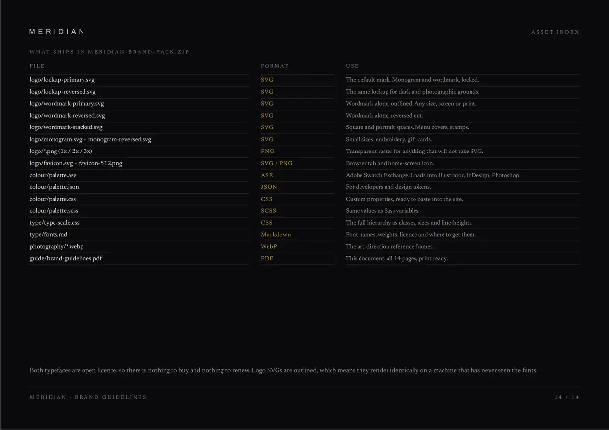
Two faces, both open licence, so there is nothing to buy and nothing to renew.
We measure what we change.
A grotesque with flat terminals and no warmth in it. Tracked out to 0.40em for the wordmark so it reads as an instrument scale rather than as a word.
SIL Open Font License 1.1, free for commercial use.
Every protocol opens with a scan and closes with the same scan, so the difference is a number rather than an opinion.
A serif under a sans, which is the inversion that keeps this from looking like every other tech-forward clinic. It also makes long explanations of equipment readable, which the brand needs.
SIL Open Font License 1.1, free for commercial use.
The device
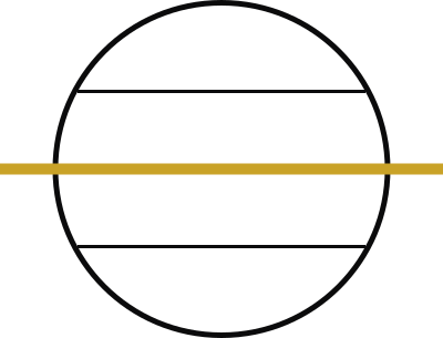
A hairline that runs the full width and passes behind the wordmark. It sets the horizon on every layout, and nothing else may cross it.
Photography
These frames are generated, art directed to the palette, and they exist to brief a real photographer later. They are reference, not a shoot.

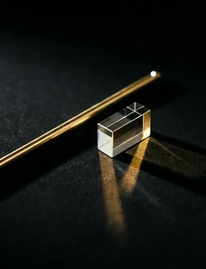
- One warm blade of light, everything else to black
- Skin clean and glass-like, polish over texture
- Instruments shot in macro like watch movements
- Profiles, closed eyes, looking away
- Soft, even, flattering fill light
- Smiling to camera
- Beige rooms and soft furnishings
- More than one light source in frame
Applications
Which mark goes where, and what it is printed on. Card and signage take the lockup, the menu cover takes the stacked mark, the gift card takes the monogram alone.
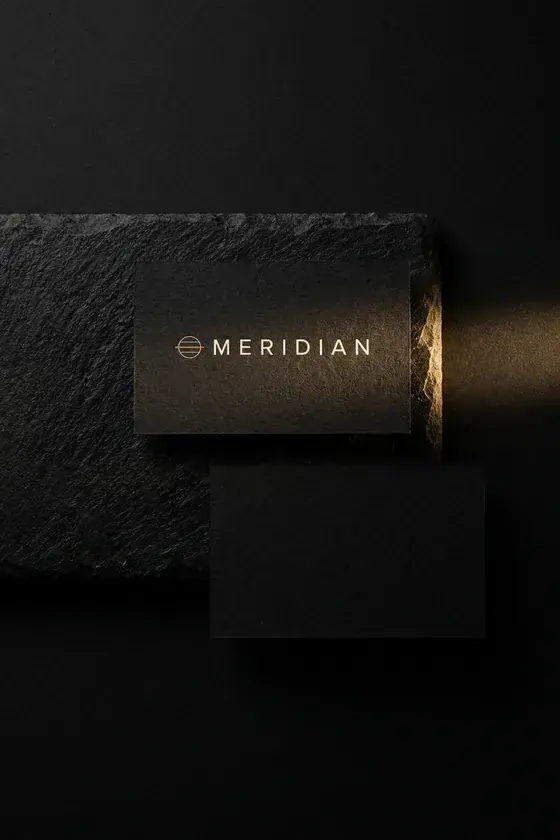
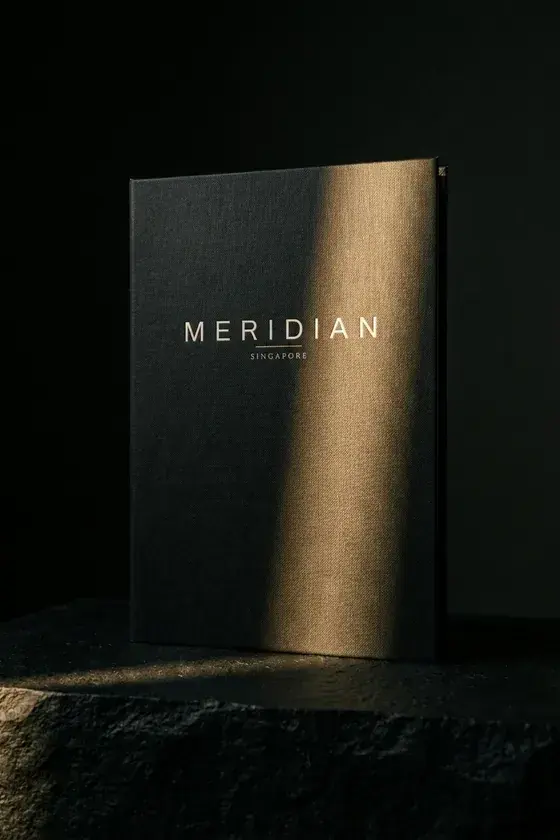
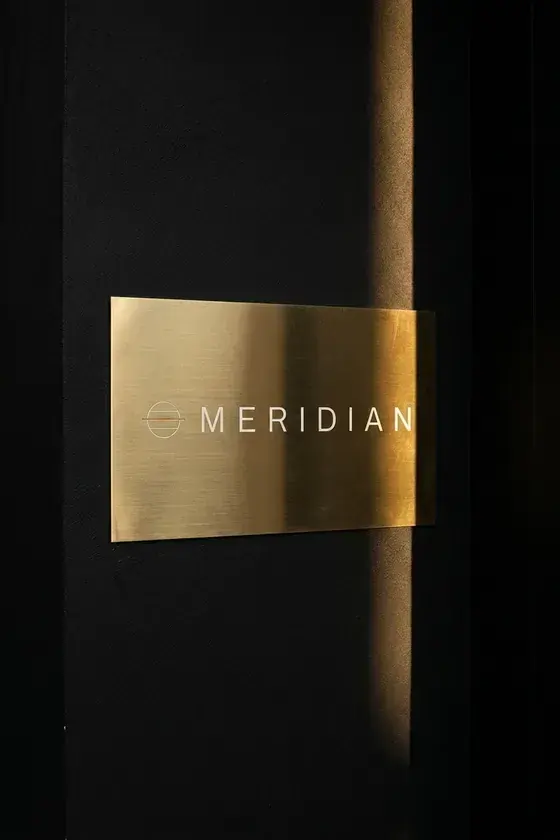
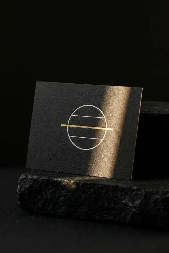
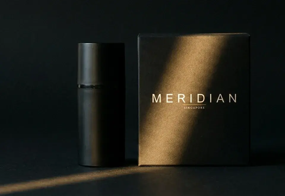
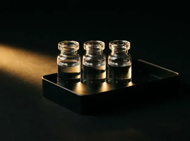
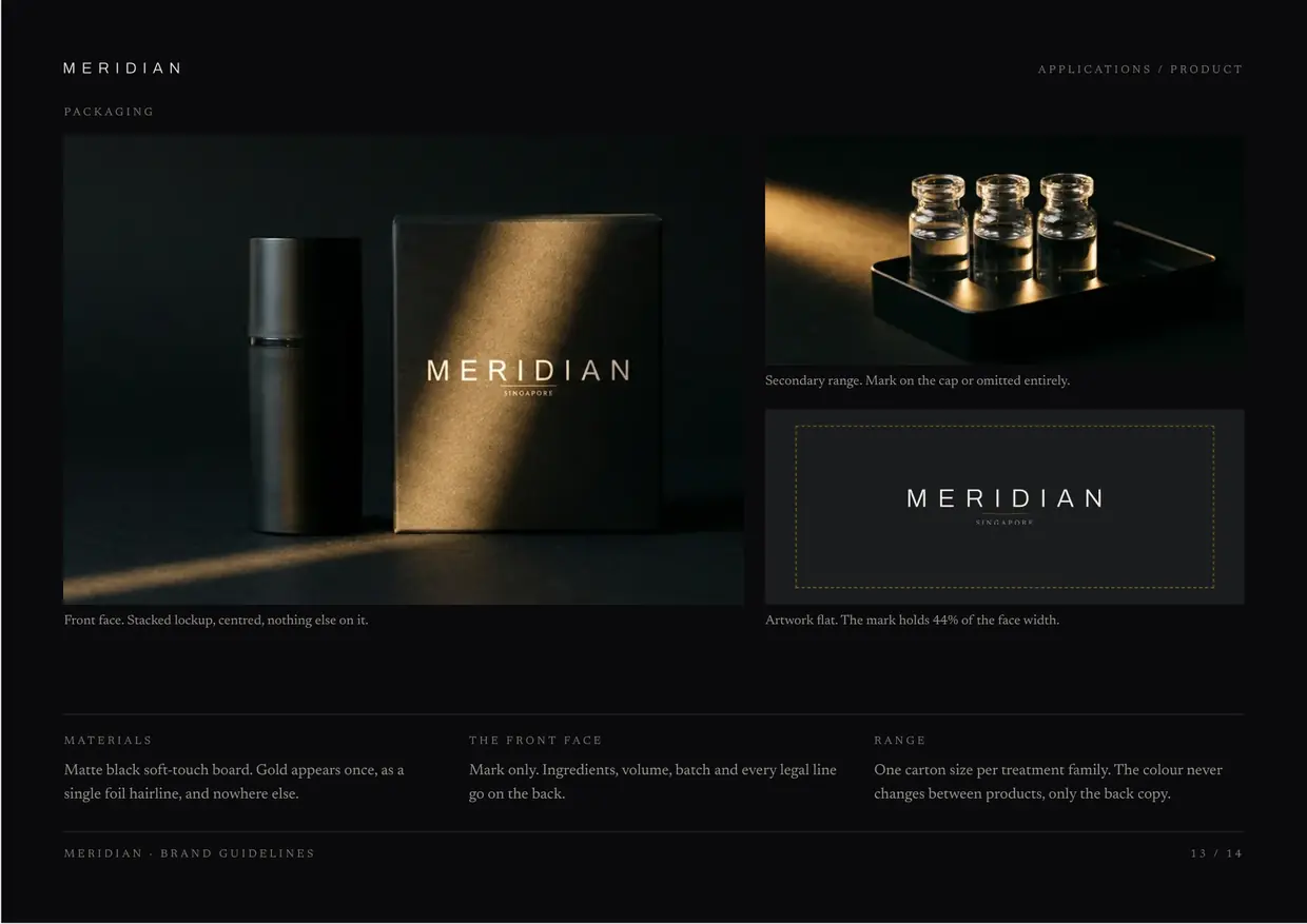
Matte black soft-touch board. Gold appears once, as a single foil hairline, and nowhere else.
Matte black soft-touch board with one gold foil hairline. Everything else on the piece is unprinted.
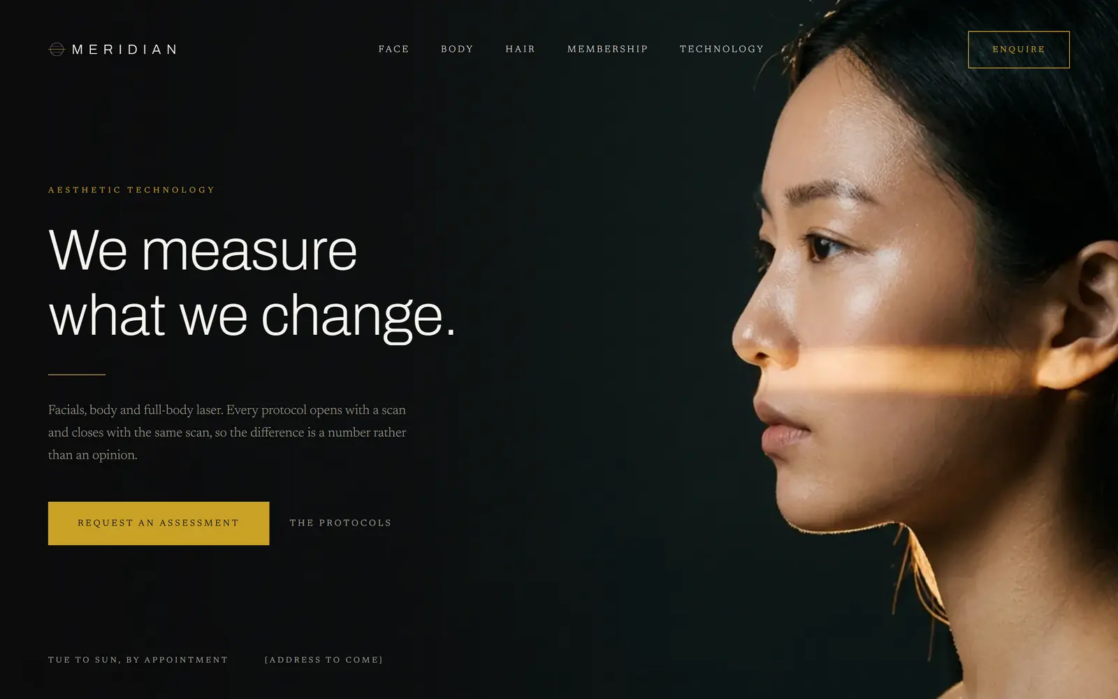
The homepage
The identity applied to the first screen of a website, which is where most of these decisions get tested first.
Fourteen pages, and the argument in two of them
Every page of the guideline document, in order. It covers the logo family, clear space, misuse, the colour system with print values, contrast grades, both typefaces, the hierarchy, the device, photography, and applications across digital, print and product.
The equipment is genuinely better than the salon down the road, and the business wants to charge for that rather than for the ambience.
It is the least warm of the three, and it sets an expectation the room has to keep. A soft beige fit-out would make this brand a promise broken at the door.
-
 01 Cover
 -
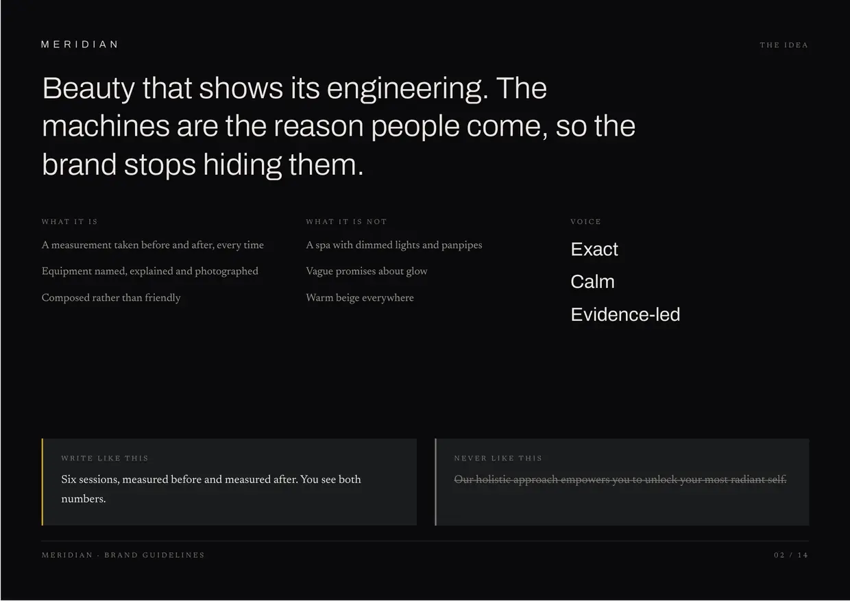 02 The idea
 -
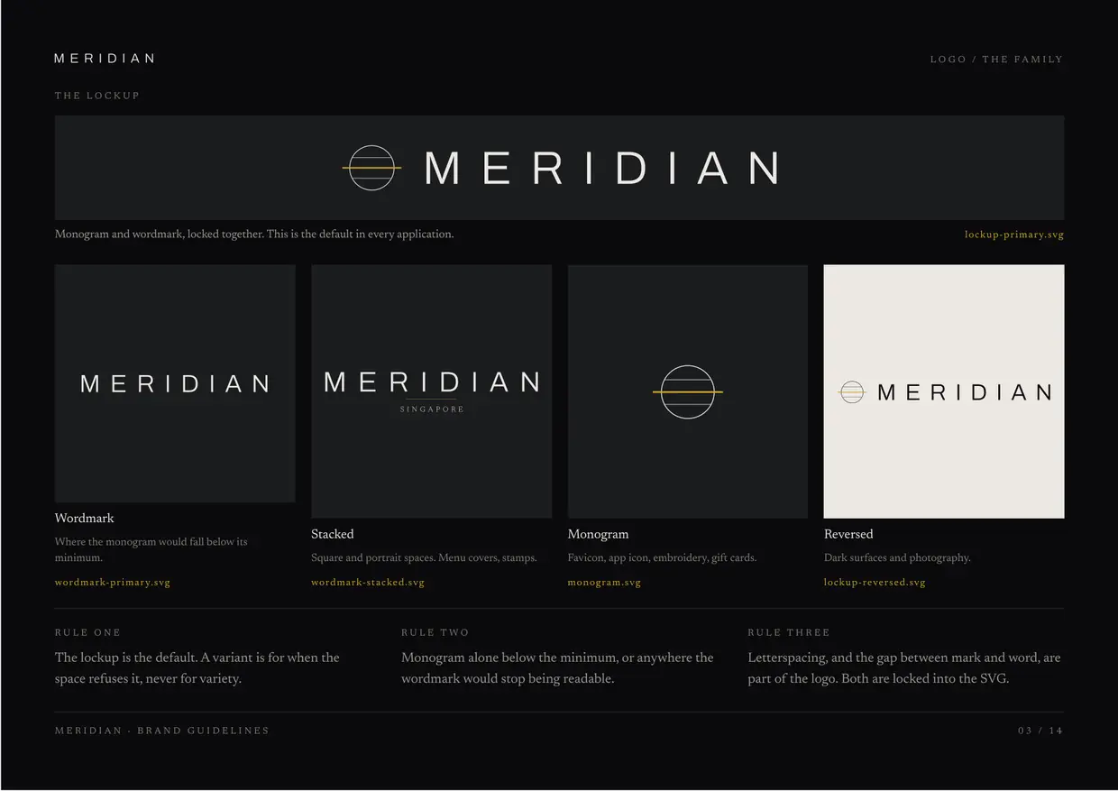 03 Logo, the family
 -
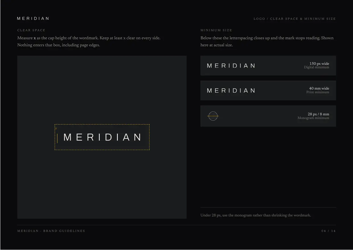 04 Logo, clear space
 -
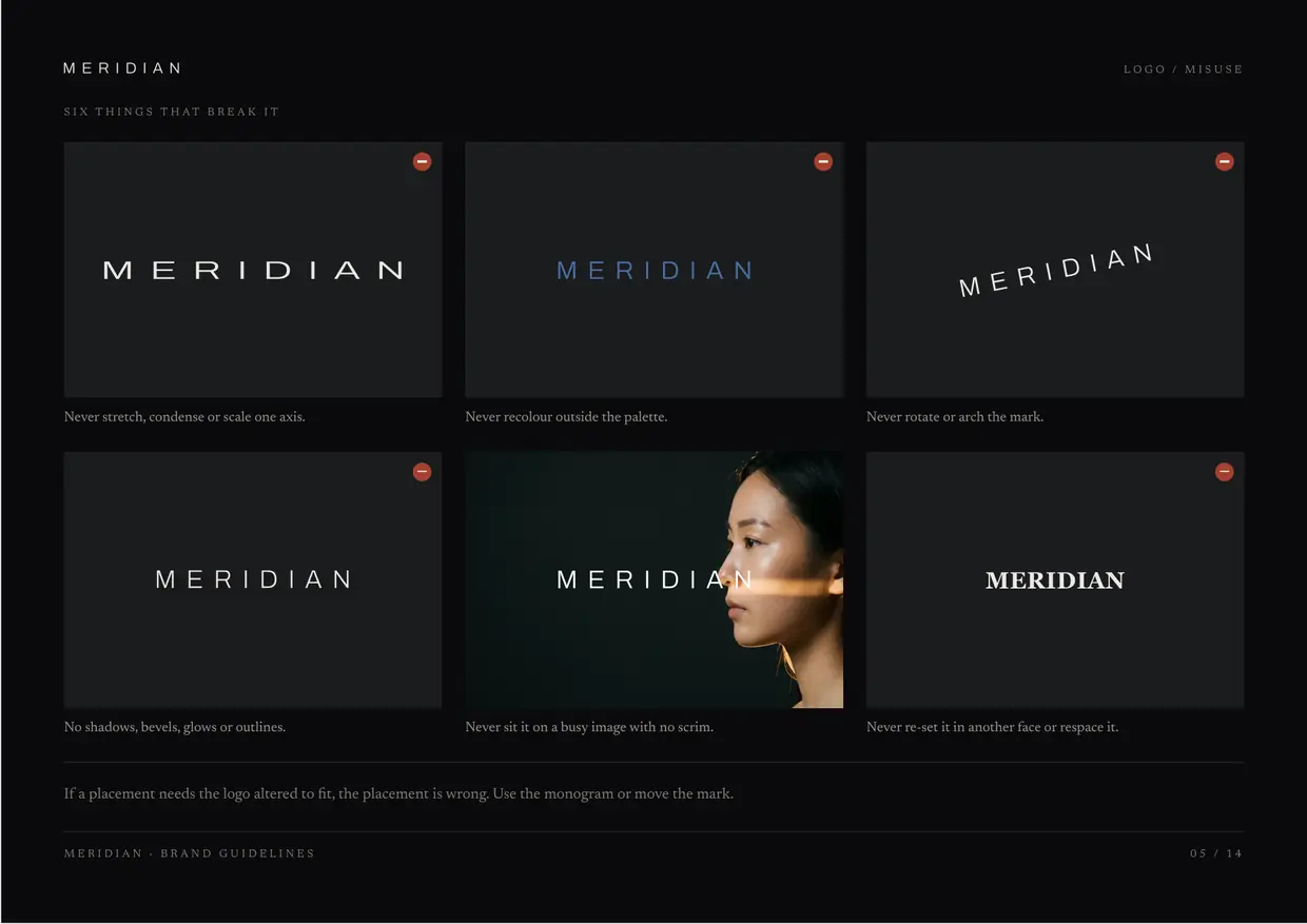 05 Logo, misuse
 -
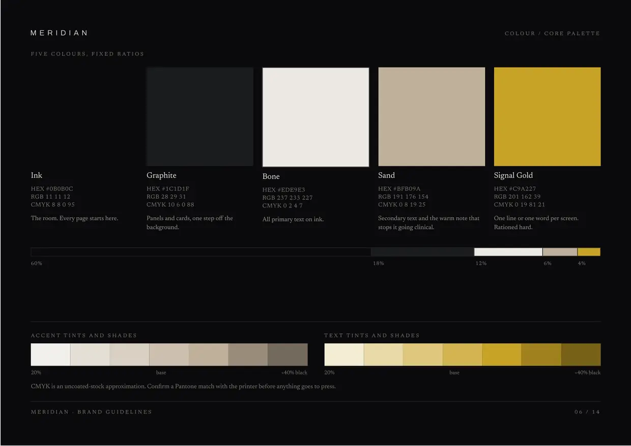 06 Colour, the palette
 -
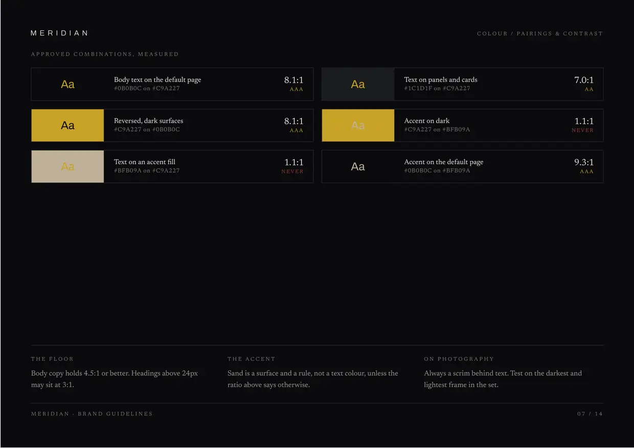 07 Colour, contrast
 -
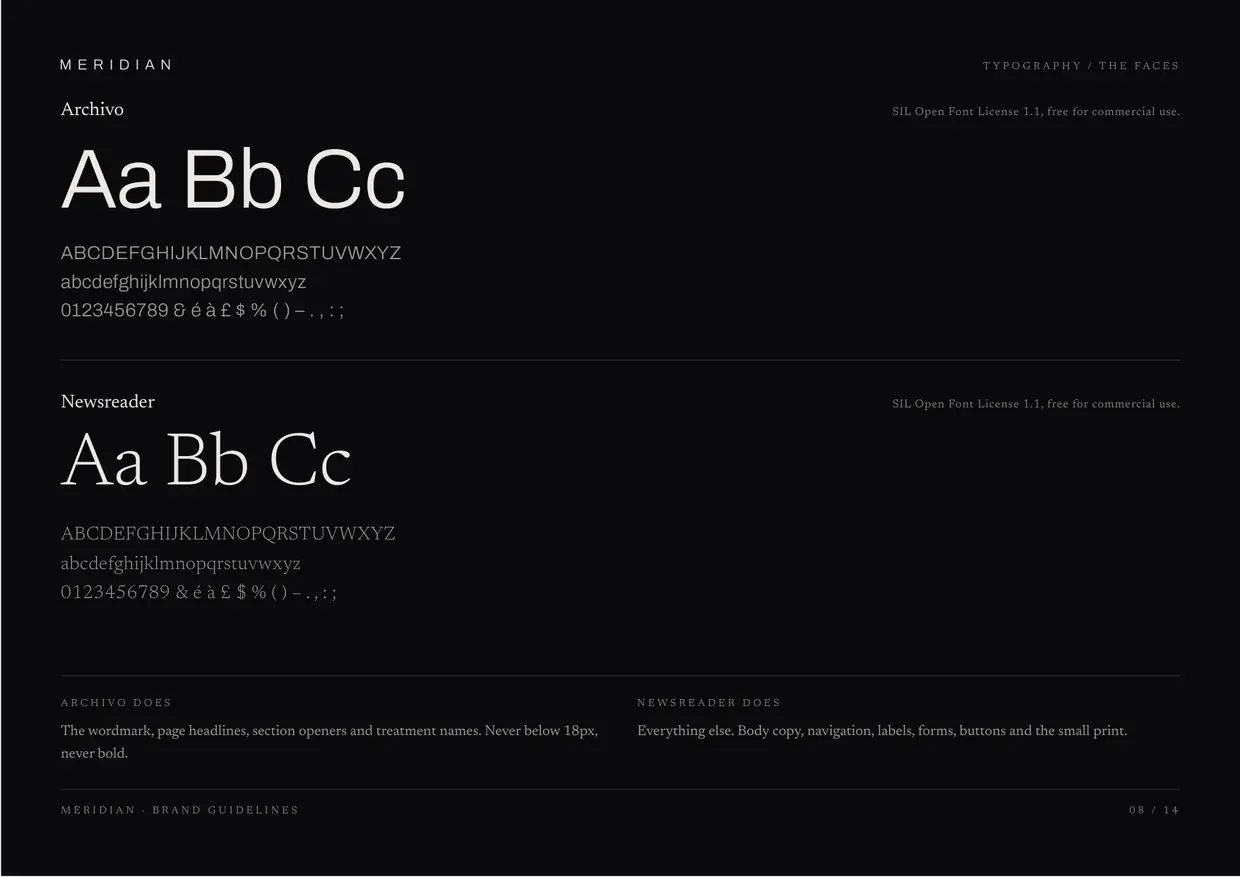 08 Type, the faces
 -
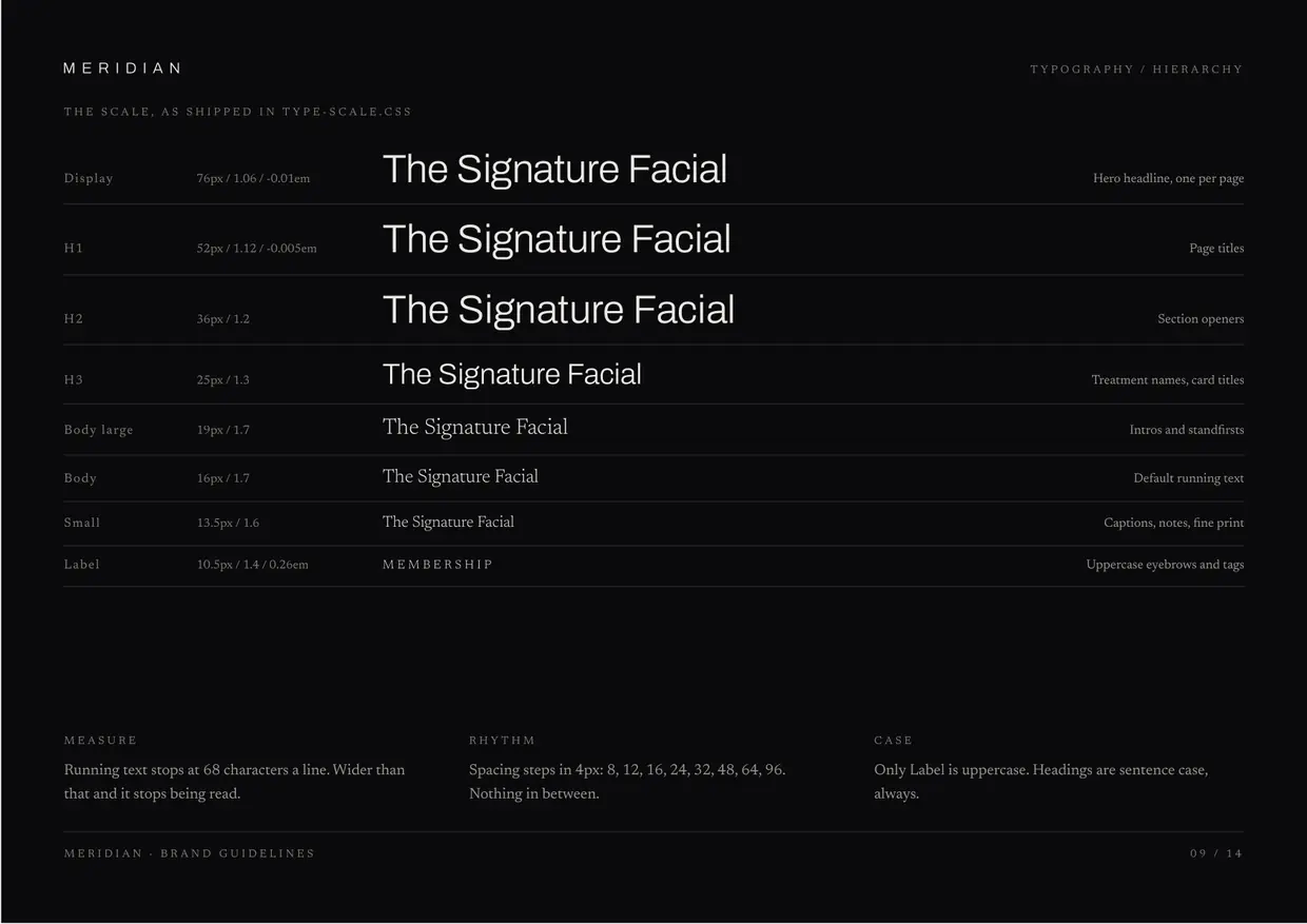 09 Type, hierarchy
 -
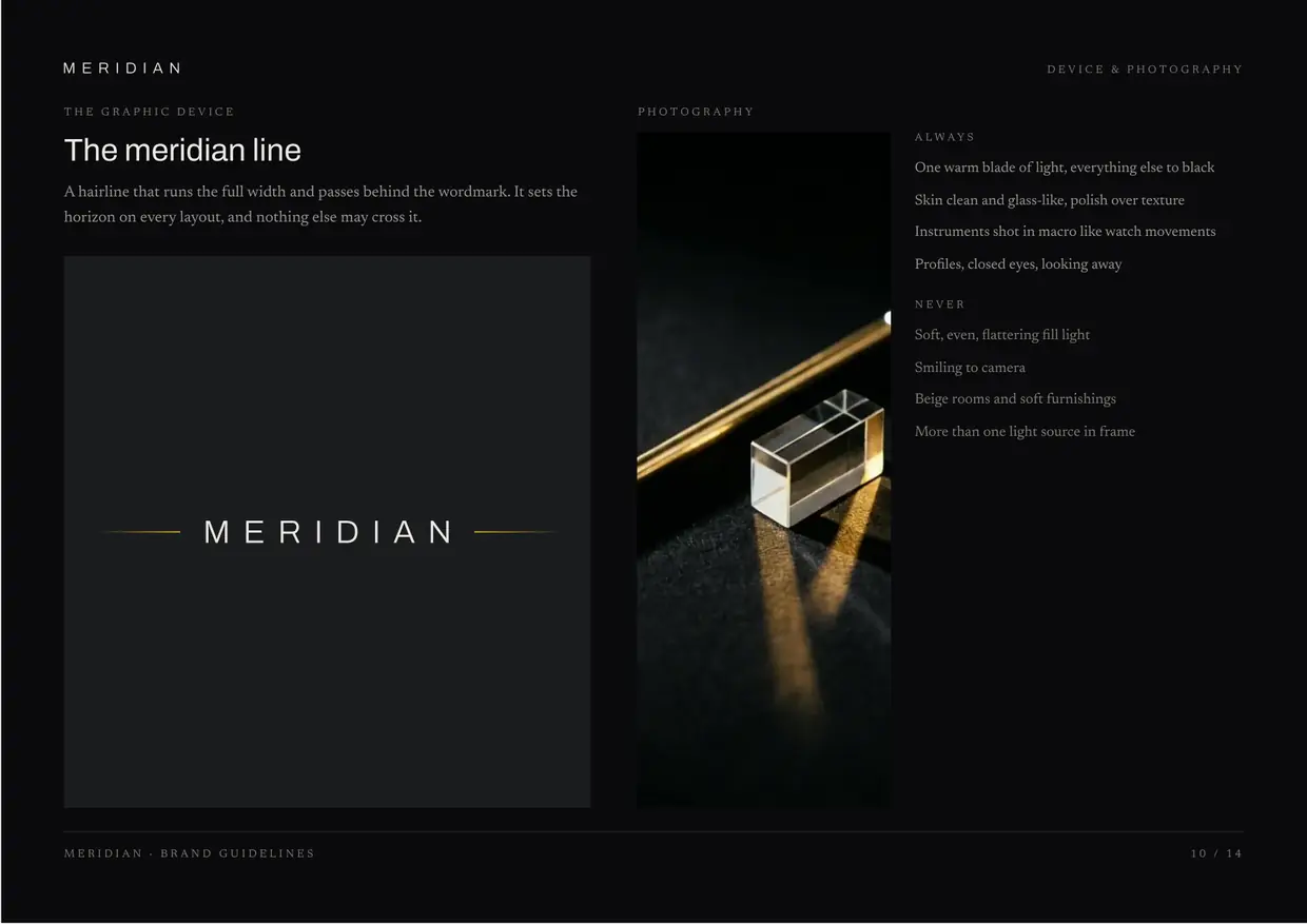 10 Device and photography
 -
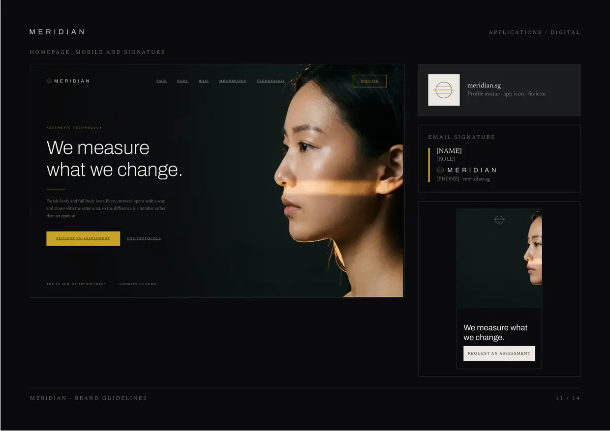 11 Applications, digital
 -
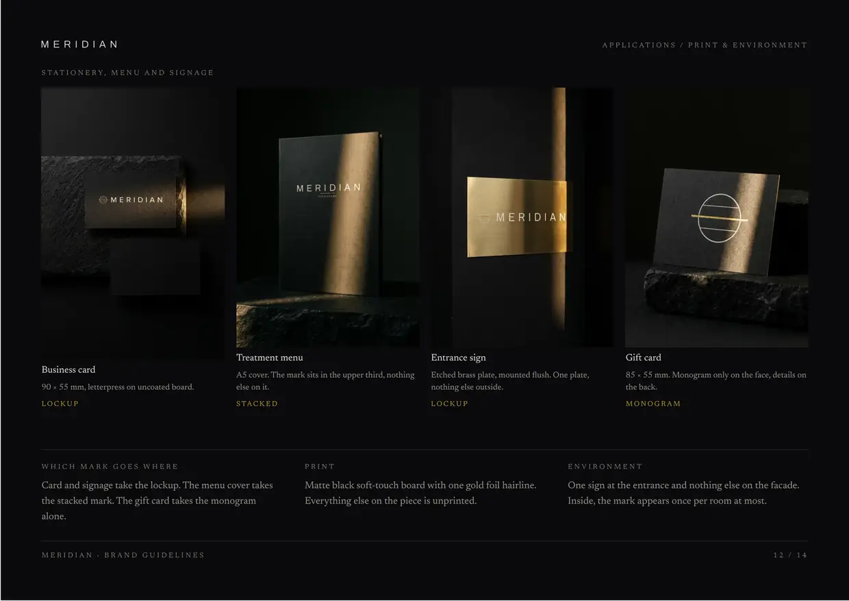 12 Applications, print
 -
 13 Applications, product
 -
 14 Asset index
A studio concept, not a client job
Meridian is one of three directions I developed against a single brief for a beauty and wellness business in Singapore. The brand name belongs to the direction, not to a company, and no client is named here because none commissioned it.
The photography is generated and art directed to the palette. It holds a site together until the real shoot happens, and it doubles as the brief for whoever shoots it. That is how imagery works on every project here, and it is included in the price rather than quoted as an extra.
If you want this done for your own business, branding runs as its own engagement or as the first stage of a website build. See what the branding service covers, or read the brand guidelines page for what ships at the end of it.
Same brief, same three colours, three different businesses underneath.
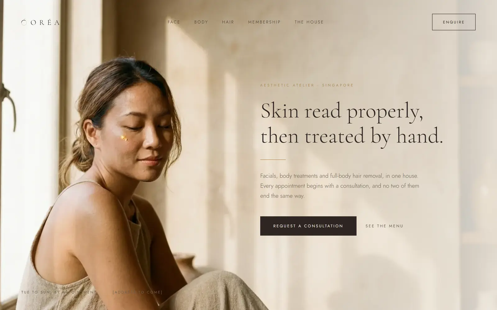 Oréa A warm, hand-made identity for a beauty and wellness house, built on bone, oat and brass. The machines stay behind the curtain.
See the direction
Oréa A warm, hand-made identity for a beauty and wellness house, built on bone, oat and brass. The machines stay behind the curtain.
See the direction
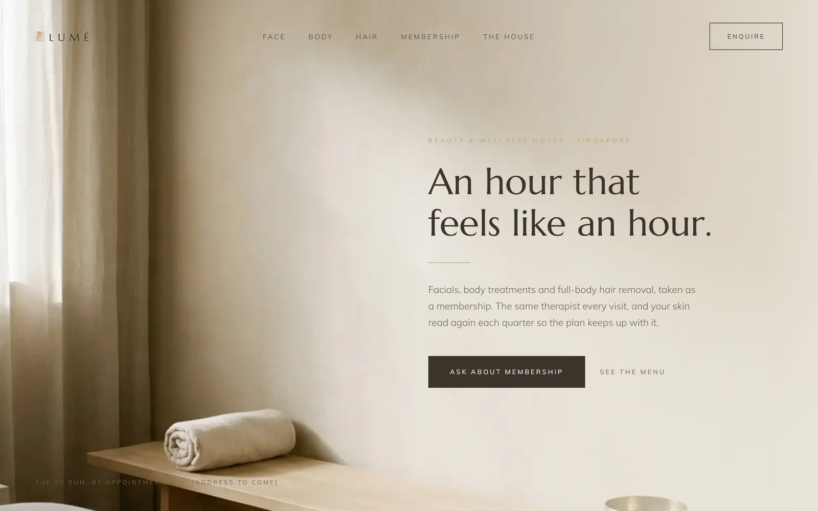 Lumé Limewash, daylight and a membership model. An identity that sells the hour rather than the result, for a business whose revenue is renewals.
See the direction
Lumé Limewash, daylight and a membership model. An identity that sells the hour rather than the result, for a business whose revenue is renewals.
See the direction
Want a brand settled before the website?
Tell me what the business does and who it is for. I will come back with directions like these, then build the site on whichever one you pick.