




 Aesthetic Atelier
 Beauty made the way it used to be made. By hand, slowly, with the technology kept out of sight.
The brief was a one-stop beauty and wellness centre. Facials, body treatments and full-body hair removal under one roof, in beige, gold and black, with beauty and technology given equal billing. That last part is where most identities in this category fall over. Put the lasers in the window and you get a clinic. Hide them completely and you get a spa, which is a lower-priced business.
Oréa answers it by treating the equipment the way a good kitchen treats its equipment. It is all there, it is all excellent, and none of it is on the pass. What the customer sees is the hand, the reading of the skin, the unhurried hour. The result is a house rather than a clinic, and a price that follows from craft instead of from machinery.
The whole system is built to be quiet. One accent colour, used as a hairline and nothing else. One graphic device. A palette that is 80 percent bone and oat, so the brass only has to appear once in a view to be noticed.
- Sector
- Beauty and wellness
- Market
- Singapore
- Year
- 2026
- Delivered
- Brand strategy, Logo and lockups, Colour and type system, Art direction, Guidelines
The idea
- A house with a door you have to be told about
- A practitioner who reads your skin before touching it
- Warm, unhurried, a little bit private
- A clinic with a price list on the wall
- Machines photographed as heroes
- Anything that shines
- Unhurried
- Specific
- Understated
A full reading of the skin, then a treatment built around what we find. No fixed protocol.
Unlock your radiance with our revolutionary cutting-edge skin solutions!
The mark
One mark module, cut six ways. Every file is outlined, so the wordmark cannot drift by being re-typed in a font that is not installed.


Colour
Five colours, and a fixed share of the page for each. The proportions are the system. Swap the percentages and you get a different brand out of the same swatches.
- Bone #F4EEE5 · 58% of a layout The page and the room. Default background everywhere.
- Oat #E4D7C5 · 22% of a layout Panels, cards, the wordmark plate.
- Clay #C6AF92 · 8% of a layout Dividers, secondary surfaces, quiet states.
- Brass #B08B4F · 6% of a layout Rules, and one detail per view. Never a large fill.
- Espresso #2E2622 · 6% of a layout All body text, and the reverse background.
Type
Two faces, both open licence, so there is nothing to buy and nothing to renew.
Skin read properly, then treated by hand.
Set light and large. At 0.42em tracking it stops being a book face and becomes a mark, which is why the wordmark is outlined from it rather than typed.
SIL Open Font License 1.1, free for commercial use.
Facials, body treatments and full-body hair removal, in one house. Every appointment begins with a consultation.
A geometric sans with a slightly warm build, so it sits under the Garamond without arguing with it. Light weight only, at generous line height.
SIL Open Font License 1.1, free for commercial use.
The device
A single hairline under a heading, always 62px, always brass. It is the only decoration the brand owns, so it never repeats twice in one view.
Photography
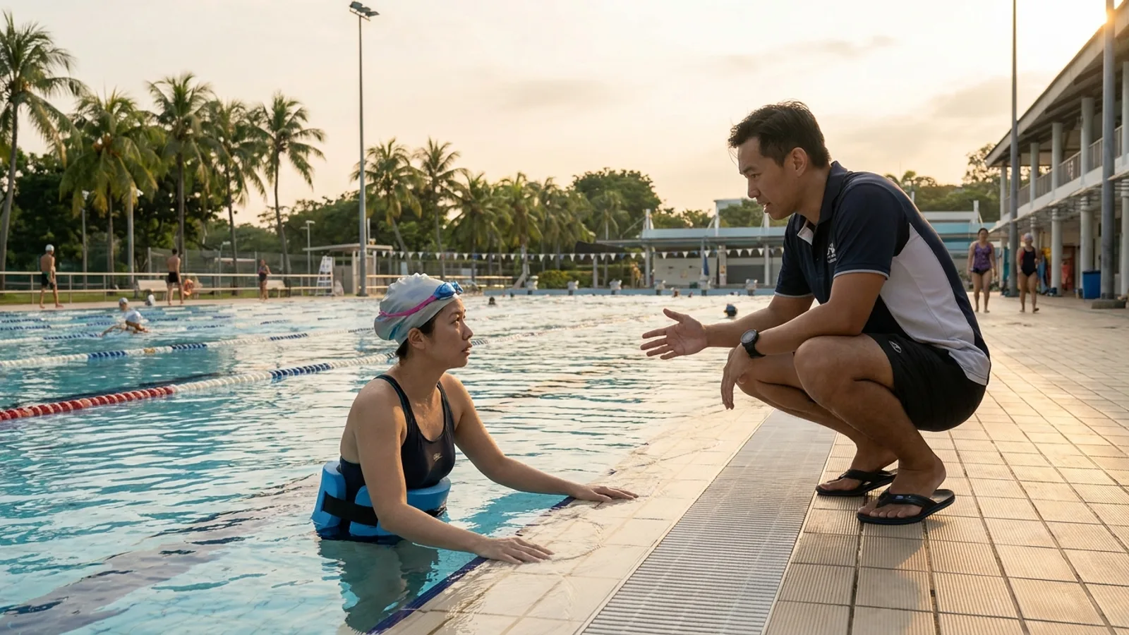
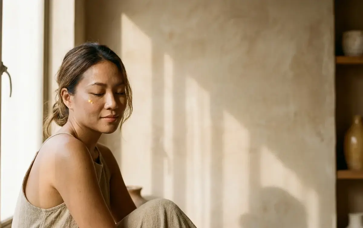
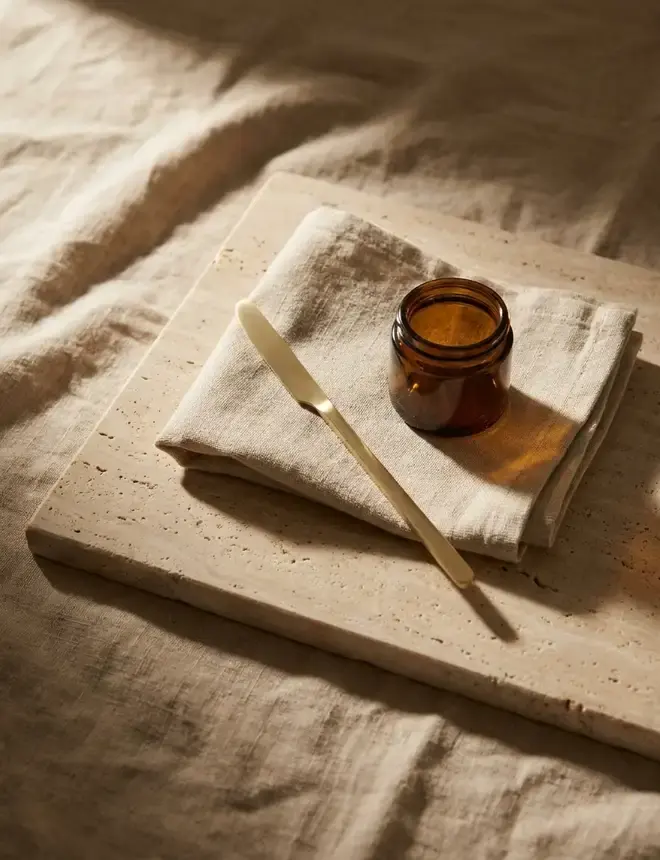
These frames are generated, art directed to the palette, and they exist to brief a real photographer later. They are reference, not a shoot.
- Window light from one side, late afternoon
- Texture kept in: linen creases, plaster grain, real pores
- Subject to one side, two thirds of the frame empty
- Brass tools on cloth, never a device
- Ring light, flash, or any studio sweep
- Smoothed, poreless retouching
- Centred, symmetrical, catalogue framing
- Stock imagery of women in towels
Applications
Which mark goes where, and what it is printed on. Card and signage take the lockup, the menu cover takes the stacked mark, the gift card takes the monogram alone.
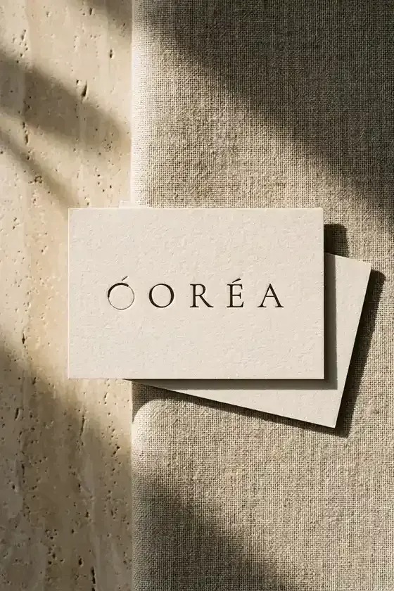
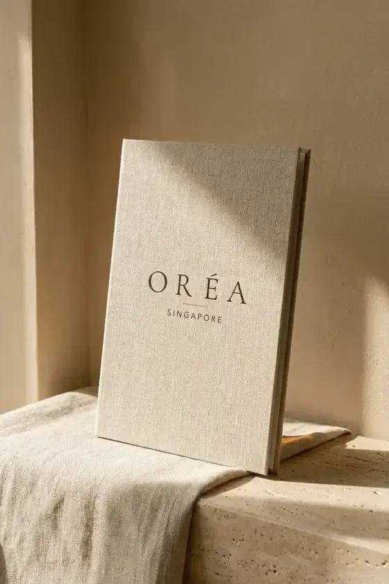
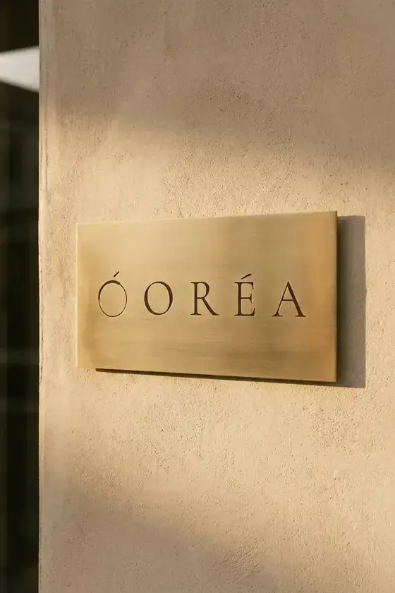
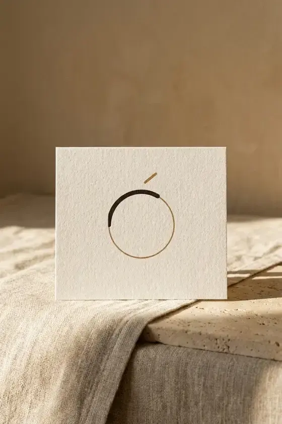
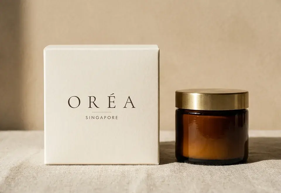
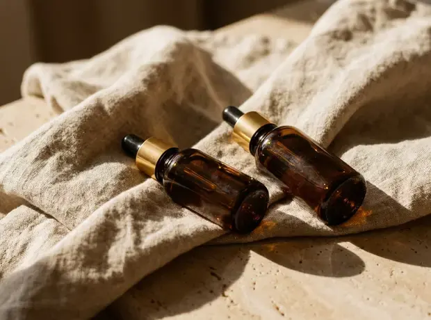
Uncoated cream board with a blind deboss, brushed brass lids. Nothing glossy, anywhere.
Uncoated cream board, letterpress deboss, no foil. Where brass appears it is real metal, never printed gold.
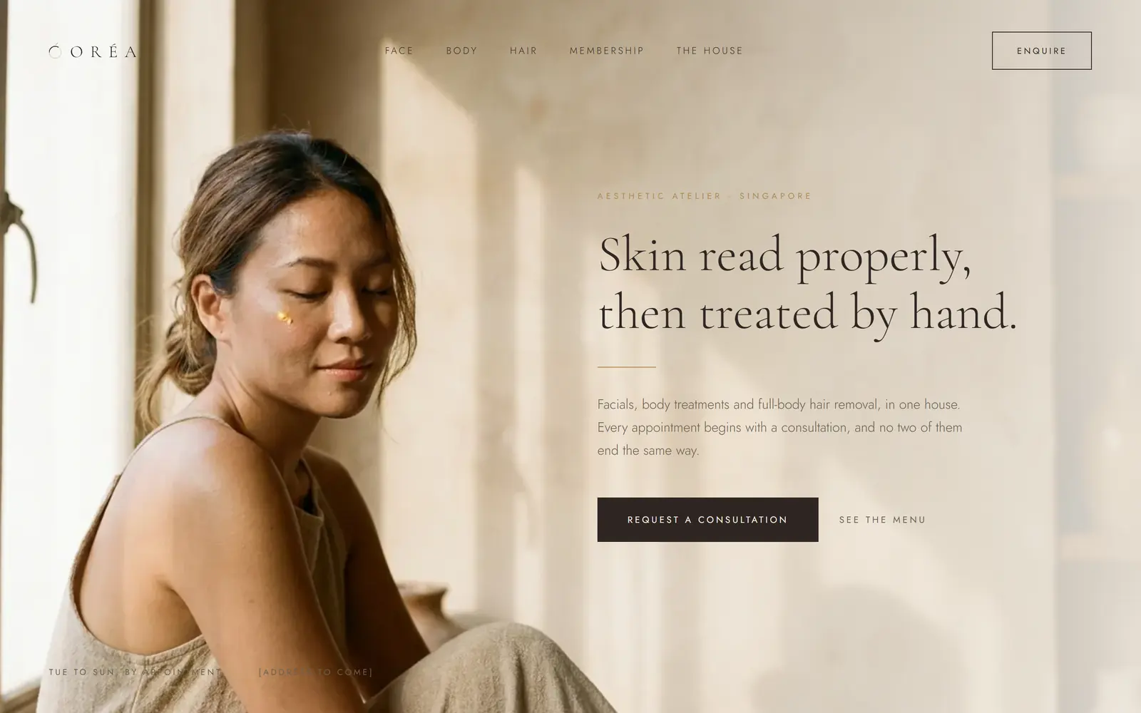
The homepage
The identity applied to the first screen of a website, which is where most of these decisions get tested first.
Fourteen pages, and the argument in two of them
Every page of the guideline document, in order. It covers the logo family, clear space, misuse, the colour system with print values, contrast grades, both typefaces, the hierarchy, the device, photography, and applications across digital, print and product.
The in-person experience is already the product, and the results story is better told in the consultation room than on the wall.
It is the softest of the three on the technology half of the brief, and it leans hard on photography. Weak images and it turns into a spa.
-
 01 Cover
 -
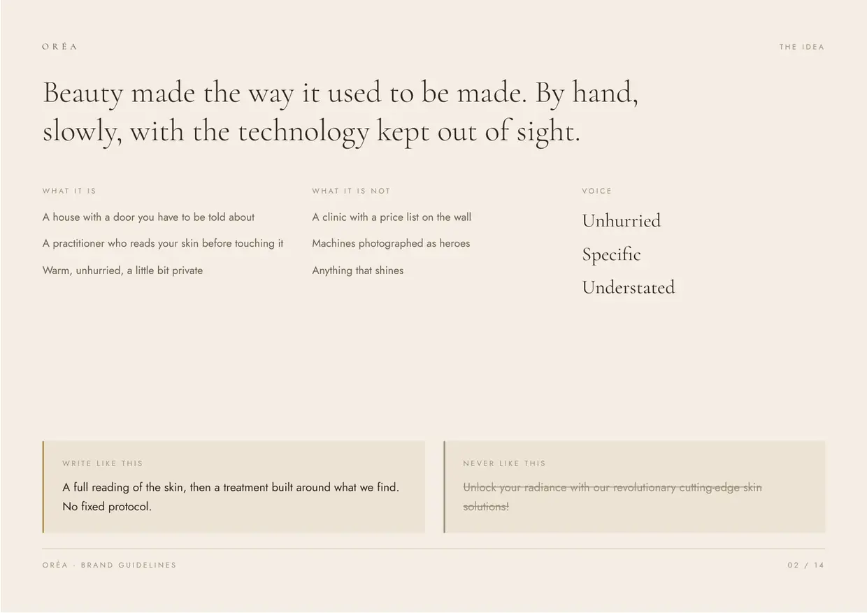 02 The idea
 -
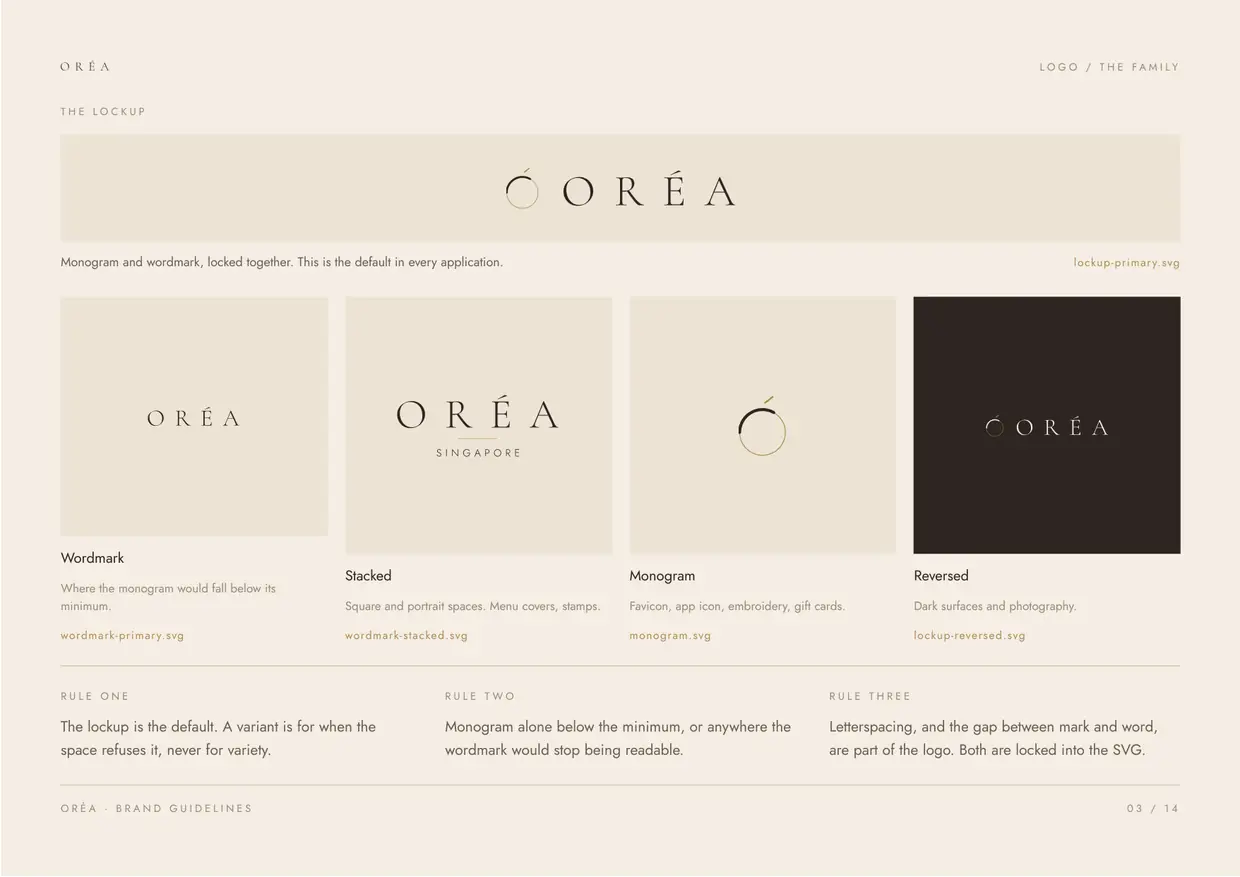 03 Logo, the family
 -
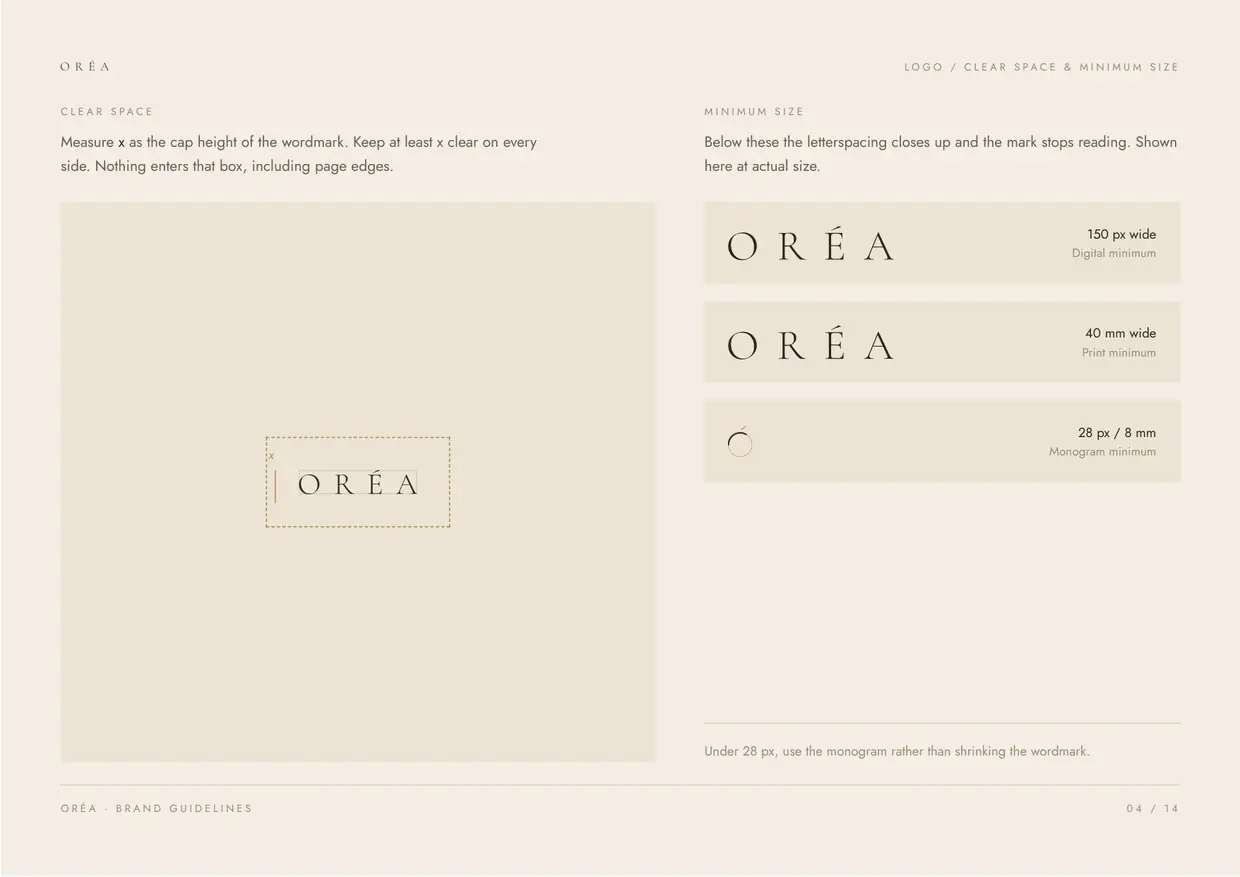 04 Logo, clear space
 -
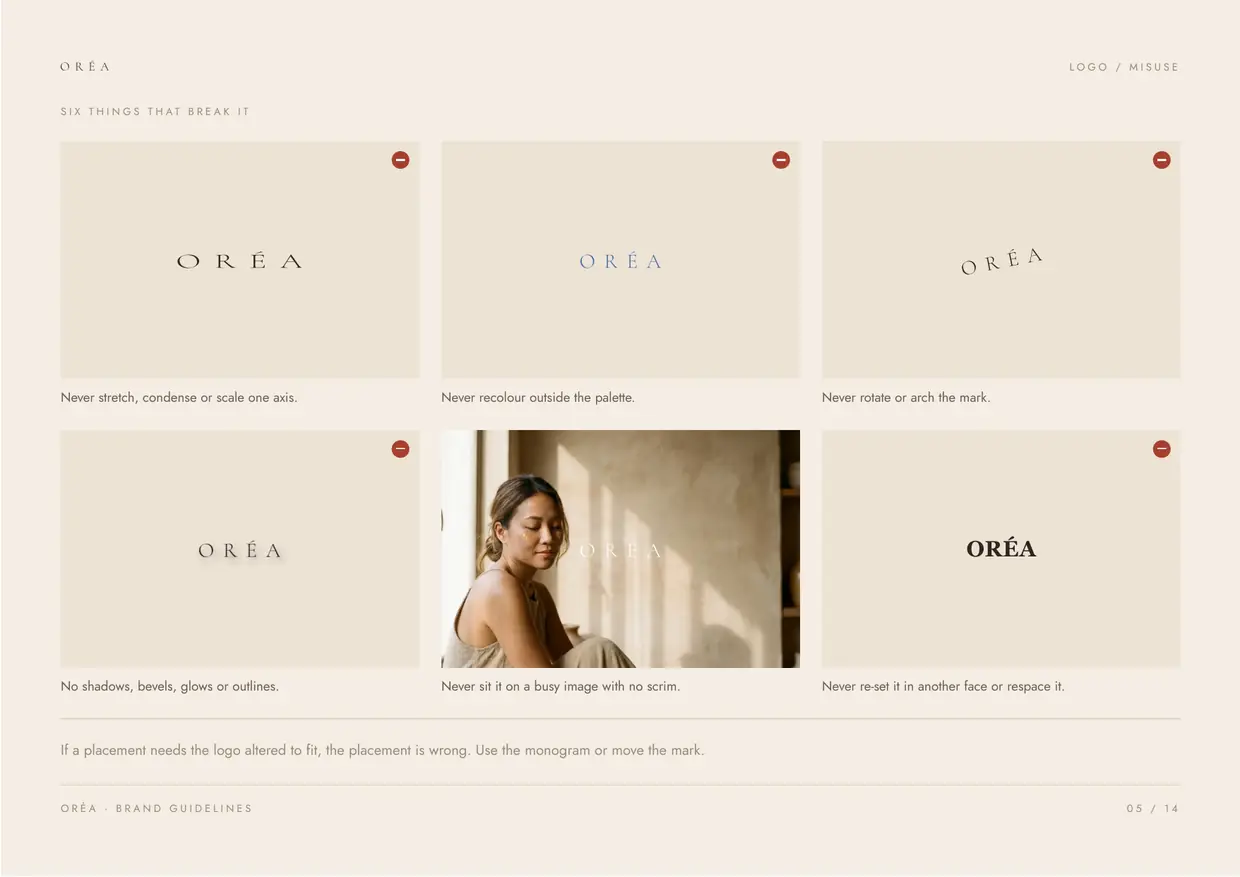 05 Logo, misuse
 -
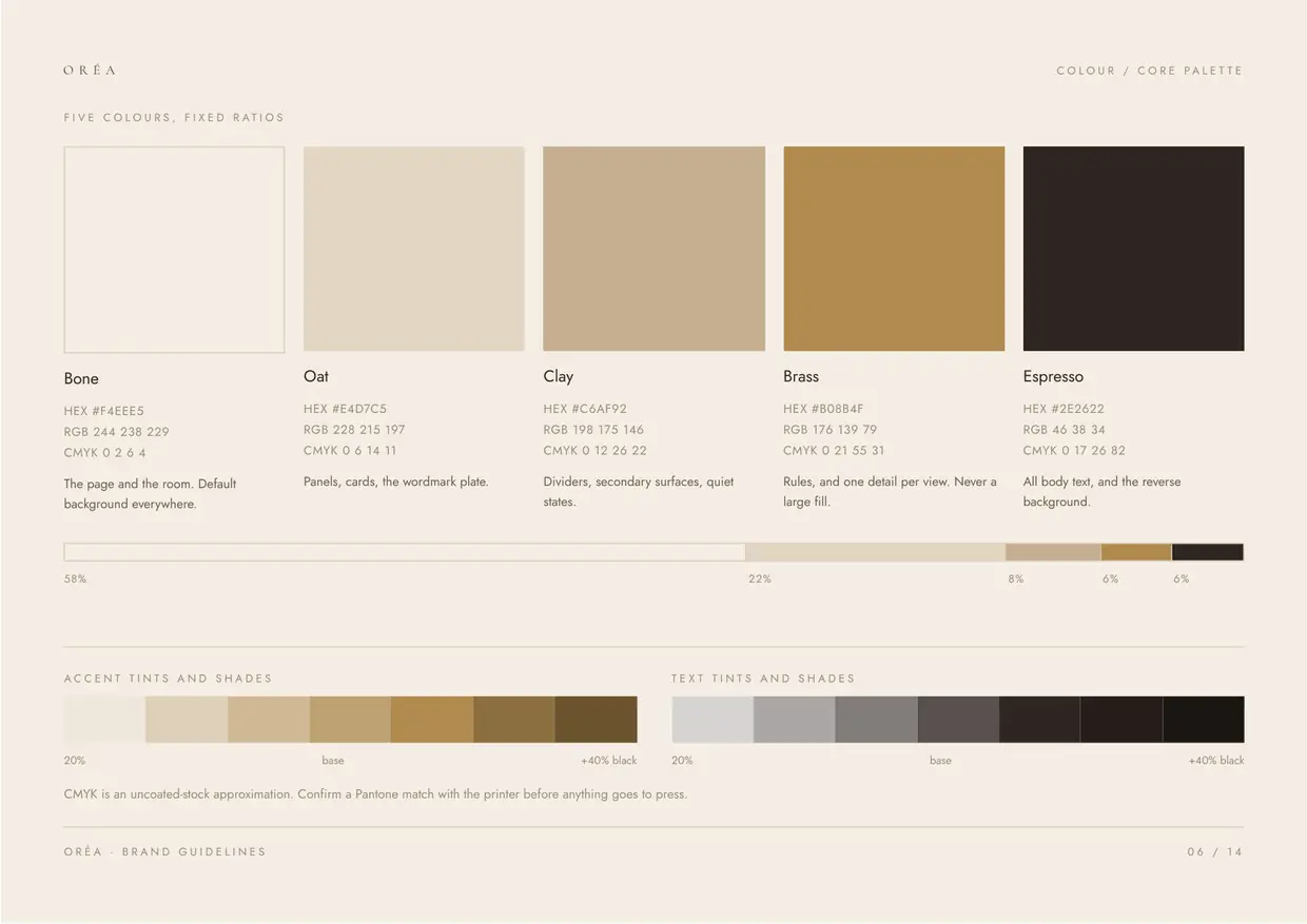 06 Colour, the palette
 -
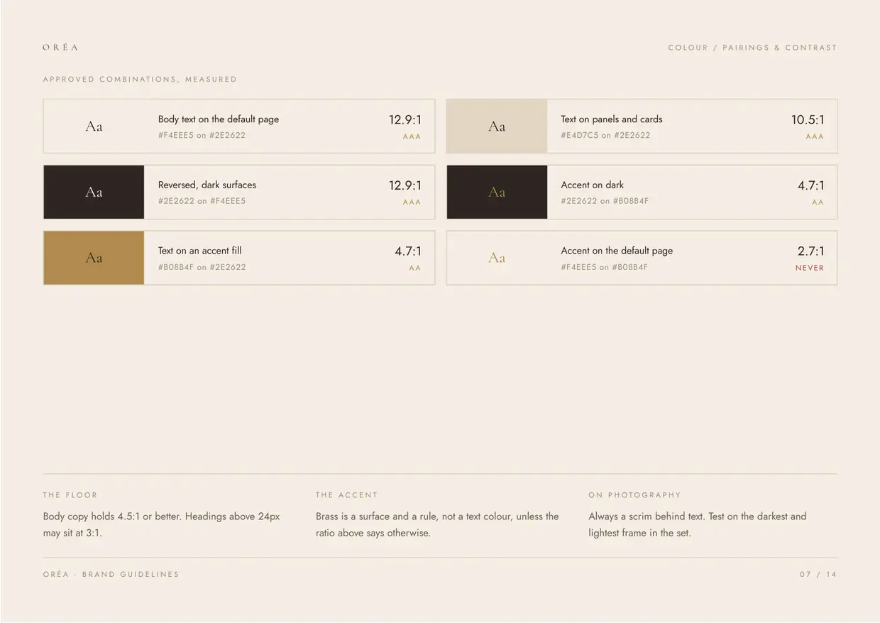 07 Colour, contrast
 -
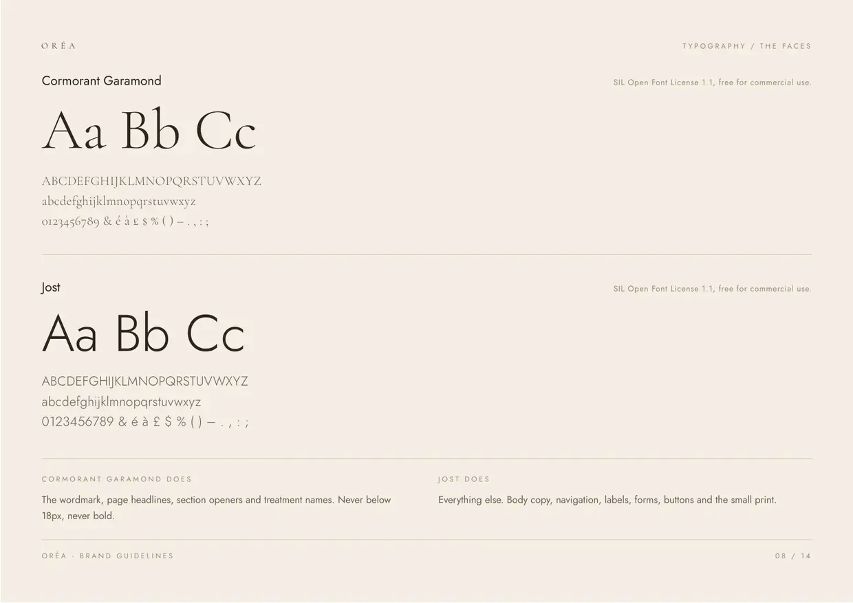 08 Type, the faces
 -
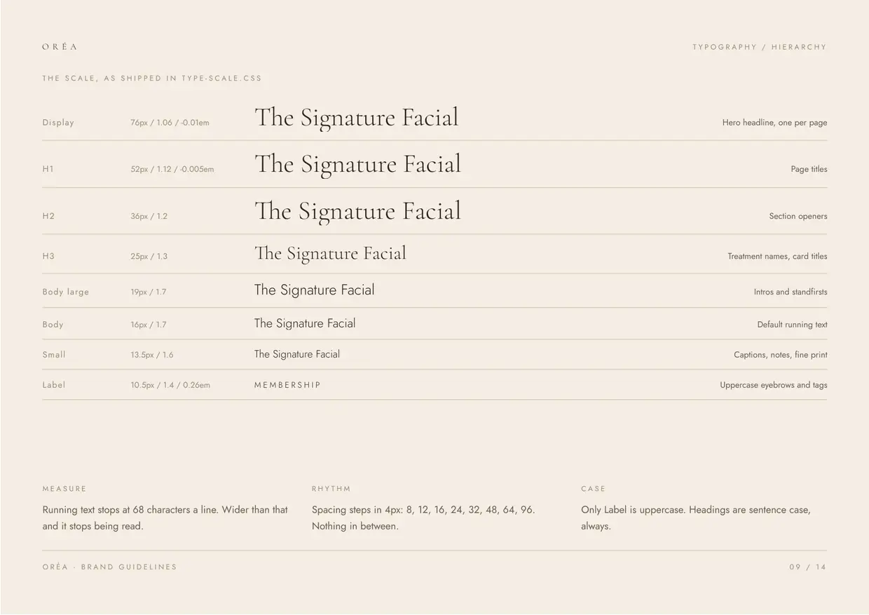 09 Type, hierarchy
 -
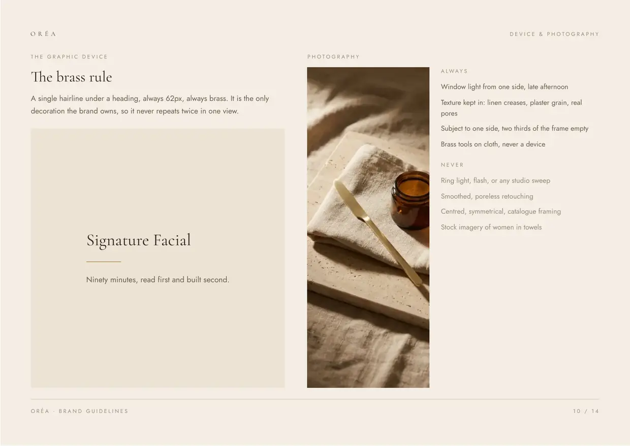 10 Device and photography
 -
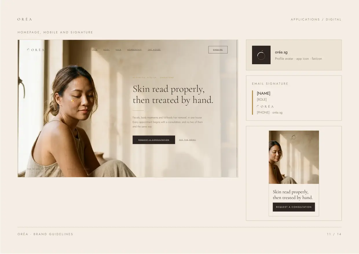 11 Applications, digital
 -
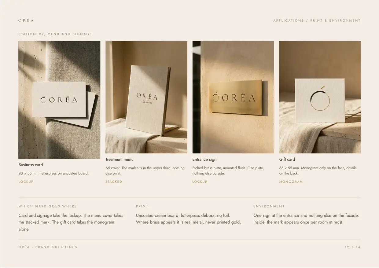 12 Applications, print
 -
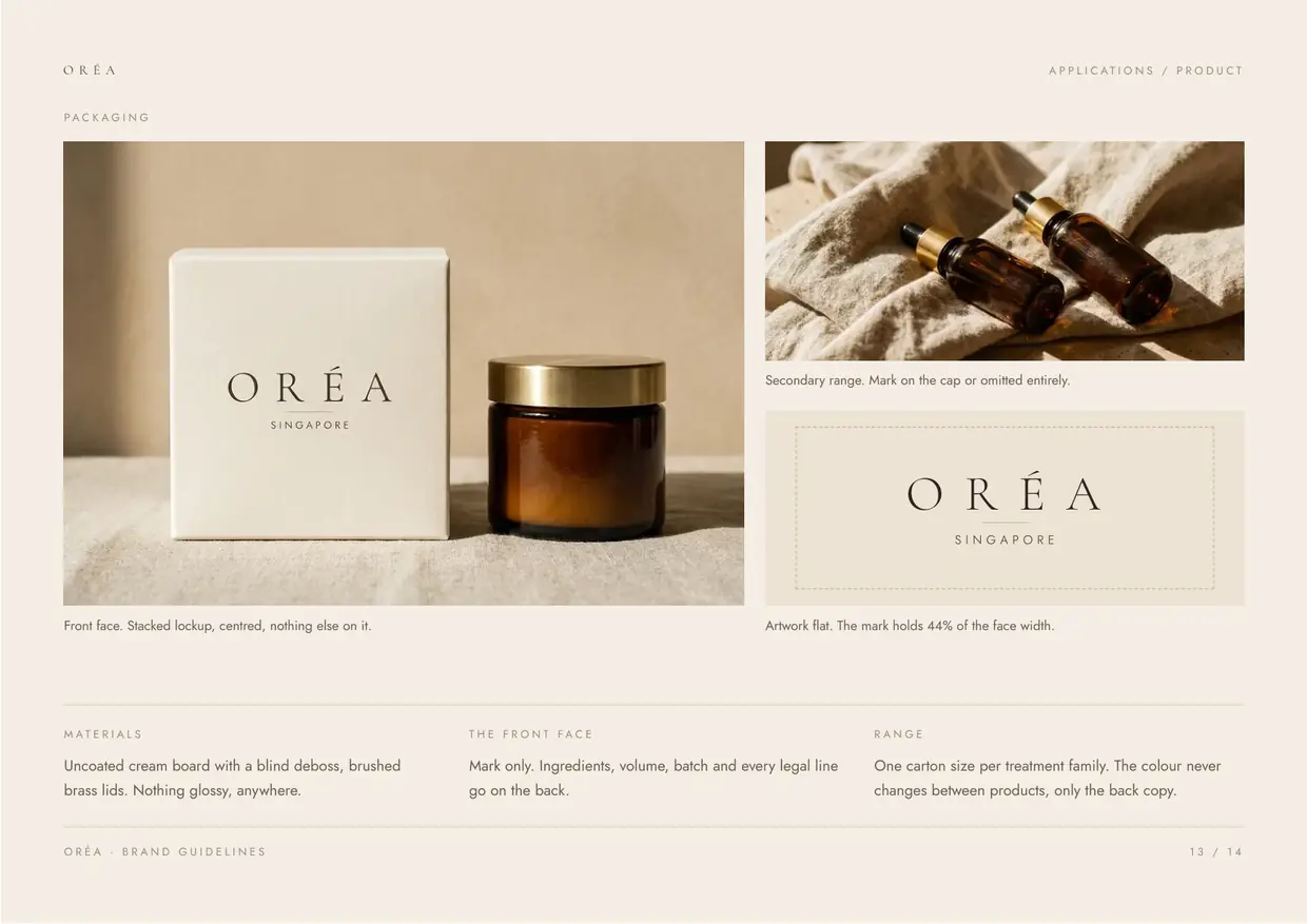 13 Applications, product
 -
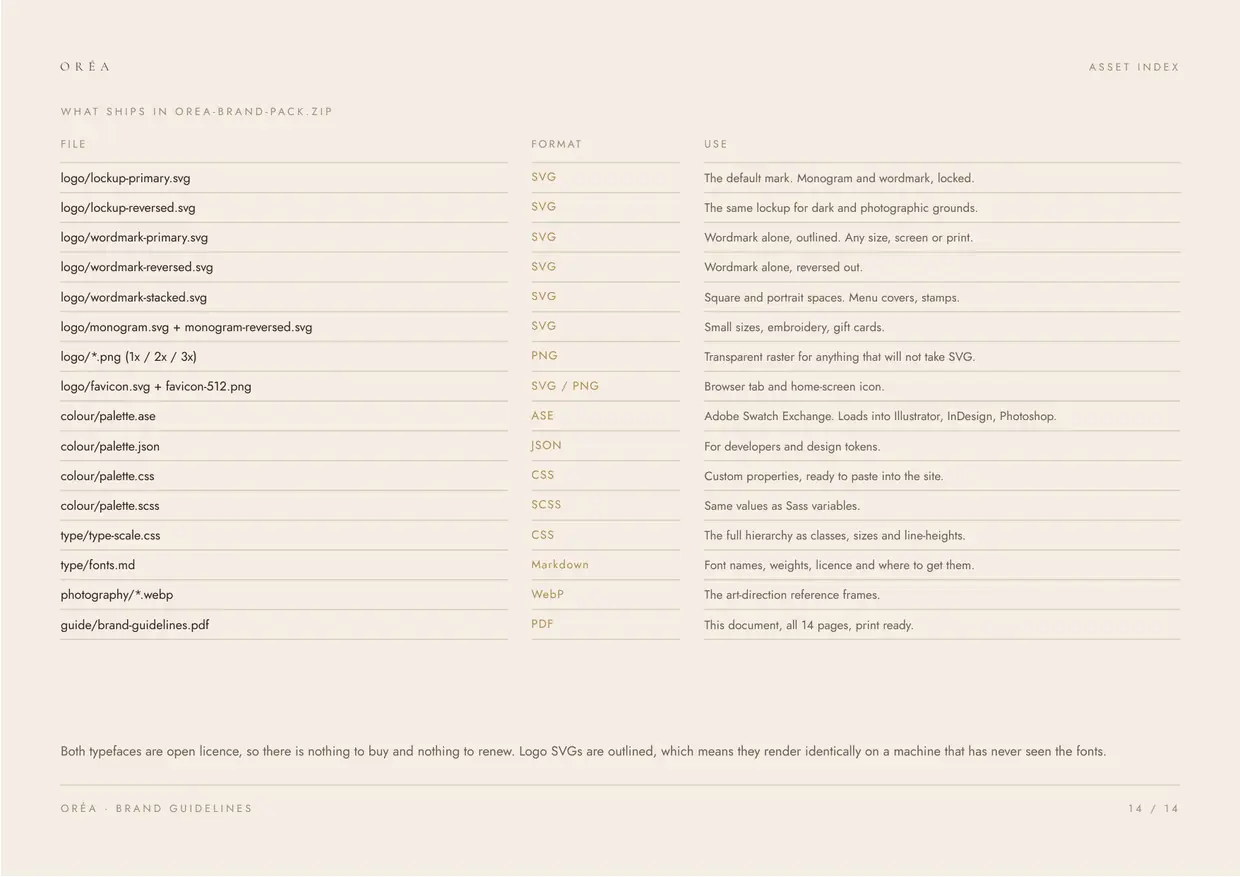 14 Asset index
A studio concept, not a client job
Oréa is one of three directions I developed against a single brief for a beauty and wellness business in Singapore. The brand name belongs to the direction, not to a company, and no client is named here because none commissioned it.
The photography is generated and art directed to the palette. It holds a site together until the real shoot happens, and it doubles as the brief for whoever shoots it. That is how imagery works on every project here, and it is included in the price rather than quoted as an extra.
If you want this done for your own business, branding runs as its own engagement or as the first stage of a website build. See what the branding service covers, or read the brand guidelines page for what ships at the end of it.
Same brief, same three colours, three different businesses underneath.
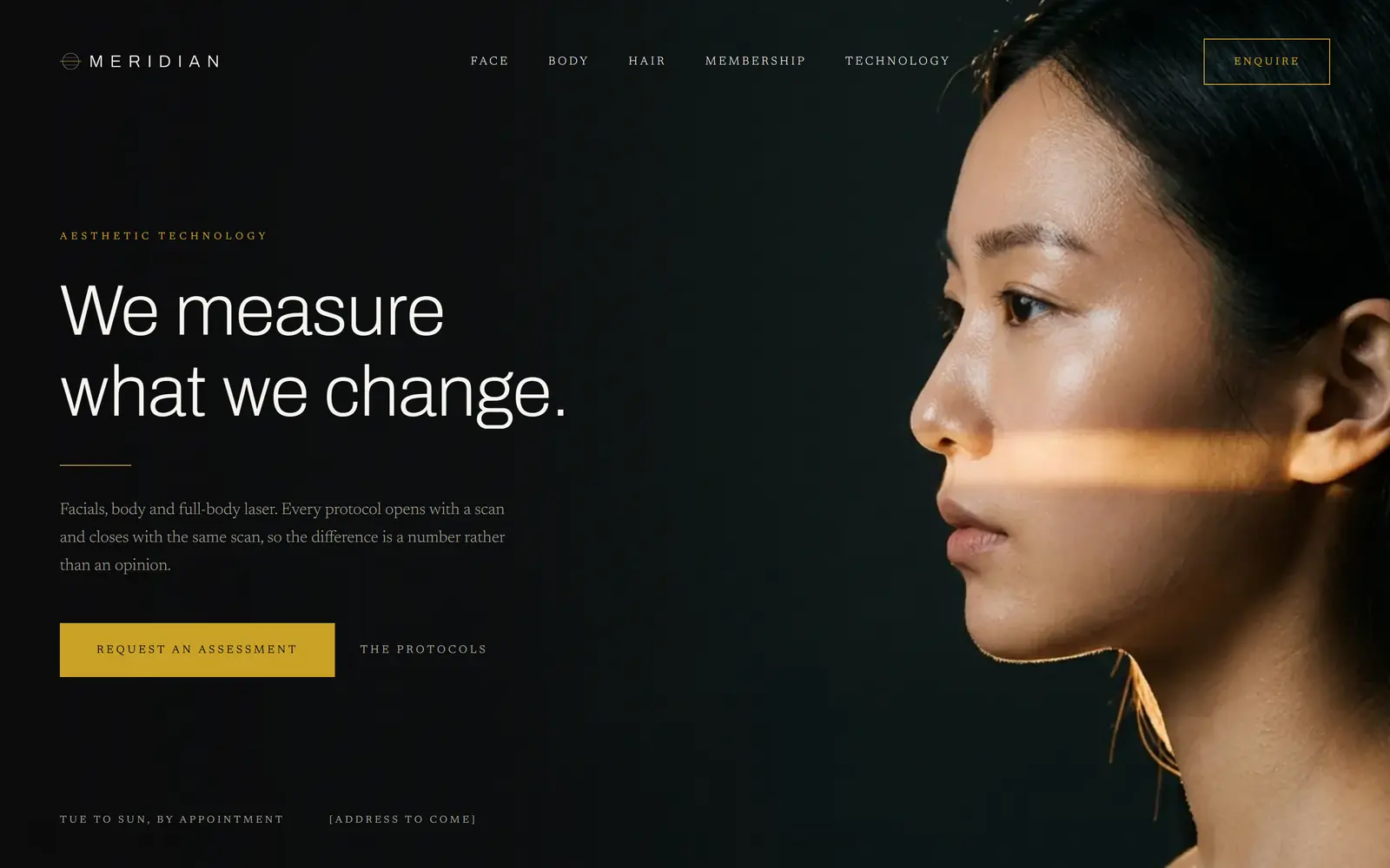 Meridian Black, gold and hairline rules for a beauty business that wants to be paid for its equipment. The technology is the luxury, and the brand says so.
See the direction
Meridian Black, gold and hairline rules for a beauty business that wants to be paid for its equipment. The technology is the luxury, and the brand says so.
See the direction
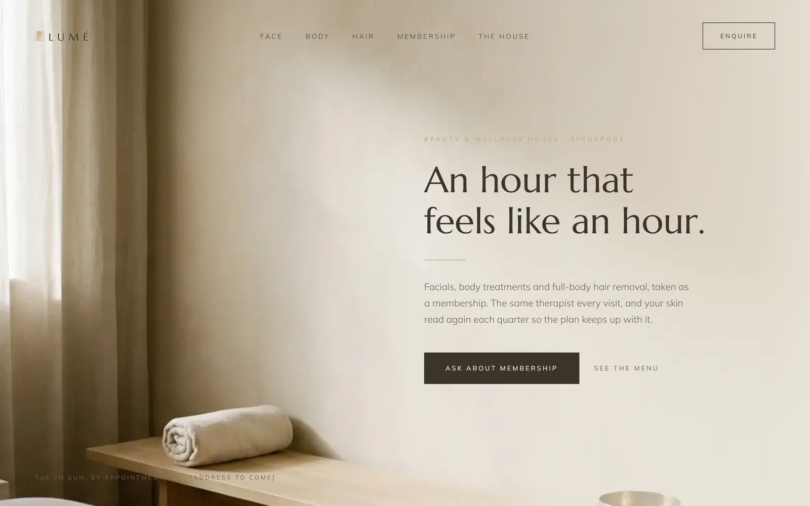 Lumé Limewash, daylight and a membership model. An identity that sells the hour rather than the result, for a business whose revenue is renewals.
See the direction
Lumé Limewash, daylight and a membership model. An identity that sells the hour rather than the result, for a business whose revenue is renewals.
See the direction
Want a brand settled before the website?
Tell me what the business does and who it is for. I will come back with directions like these, then build the site on whichever one you pick.