

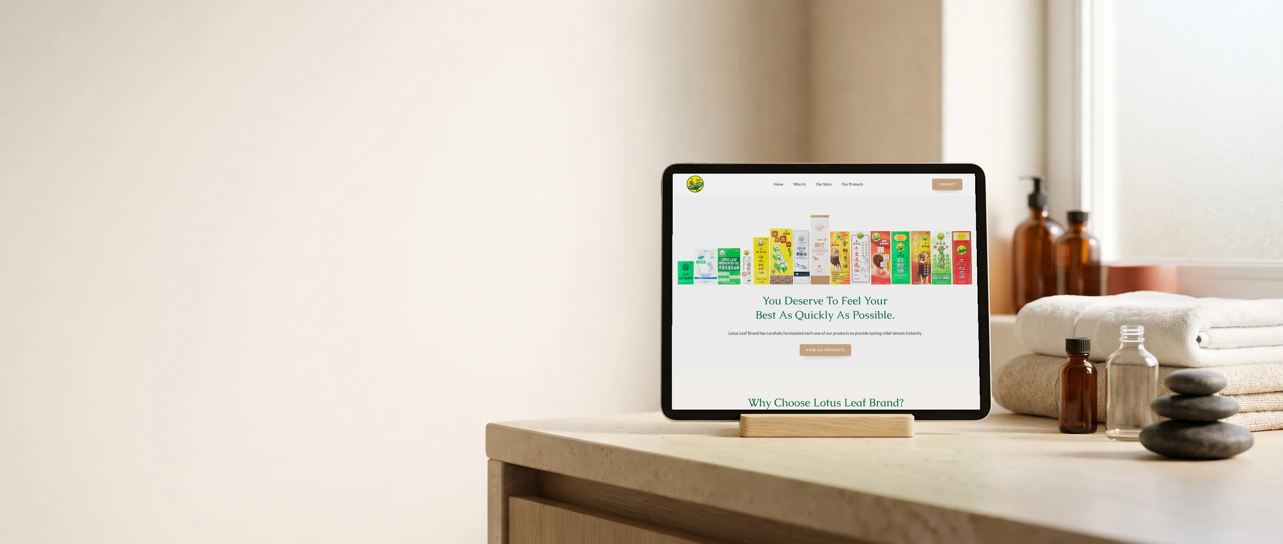
Hi, I'm Terris. I designed and built this site myself, start to finish.
Lotus Leaf Brand
Lotus Leaf Brand has made medicated oils and ointments in Singapore since 1983, and is now run with the founder's second generation.
The project at a glance
I built the site around the founder's story and the products themselves. The boxes stay front and centre, because in this category the packaging is what people recognise.
- Client
- Lotus Leaf Brand (Hwa Trading (S) Pte Ltd)
- Industry
- Consumer Health Products
- Location
- Sims Avenue, Singapore
- Built
- 2026
- Time to build
- 3 weeks
- Live site
- lotusleafbrand.com.sg
What I did
Built with
WordPress, PHP, Google Fonts
In numbers
- 1983 Brand Founded
- 40+ Years Formulating
- 2 Generations Running It
- 5 Use Cases Mapped
Counts from the site I built, and figures the business publishes about itself.
What wasn't working, and how I fixed it
Before
Customers knew Lotus Leaf by its boxes, not its name
The lion, the red flower oil, the green medicated oil and the Chinese characters are what people have recognised for four decades. Put the brand online without them and something people have used all their lives can look like it started last year.
What I did
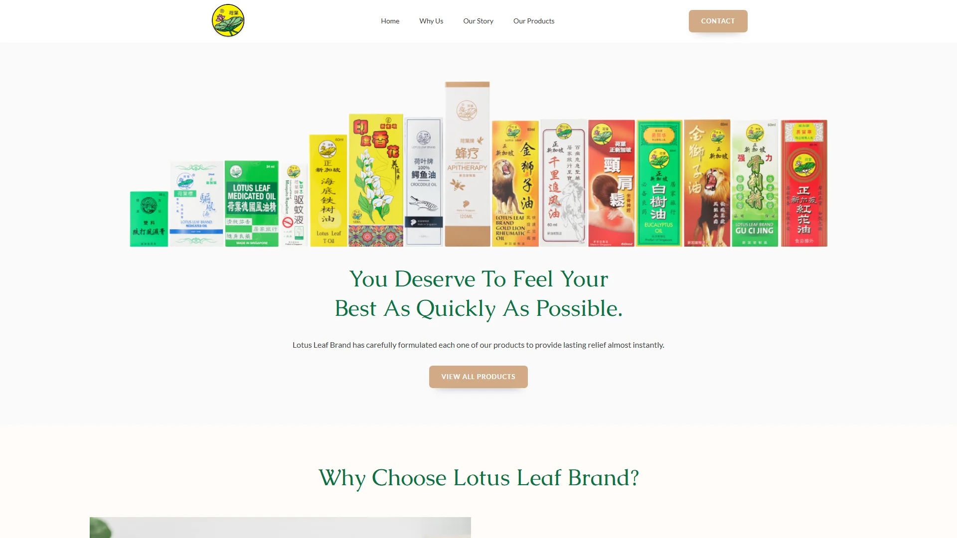
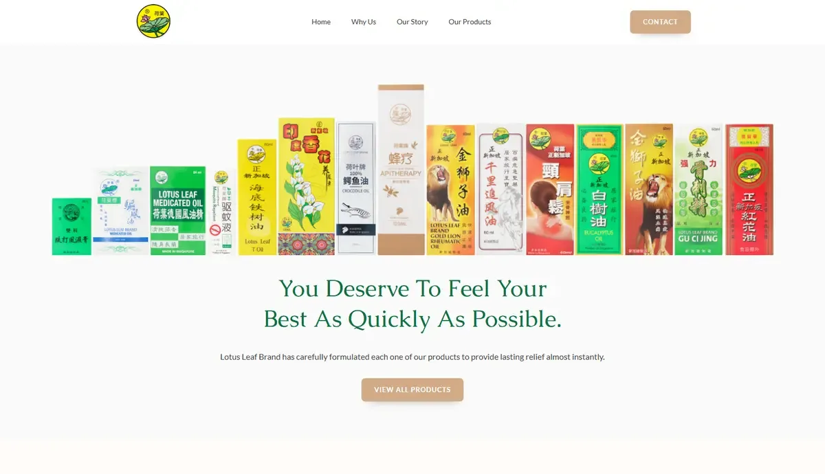
I opened the site on the whole range, box by box
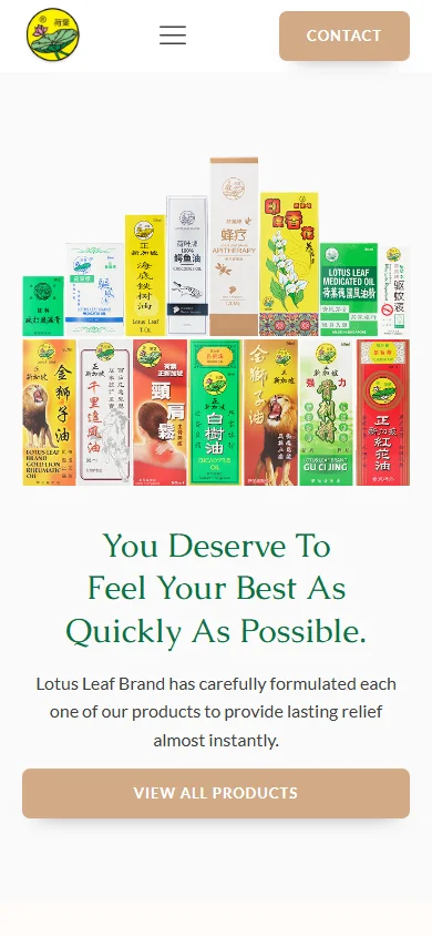
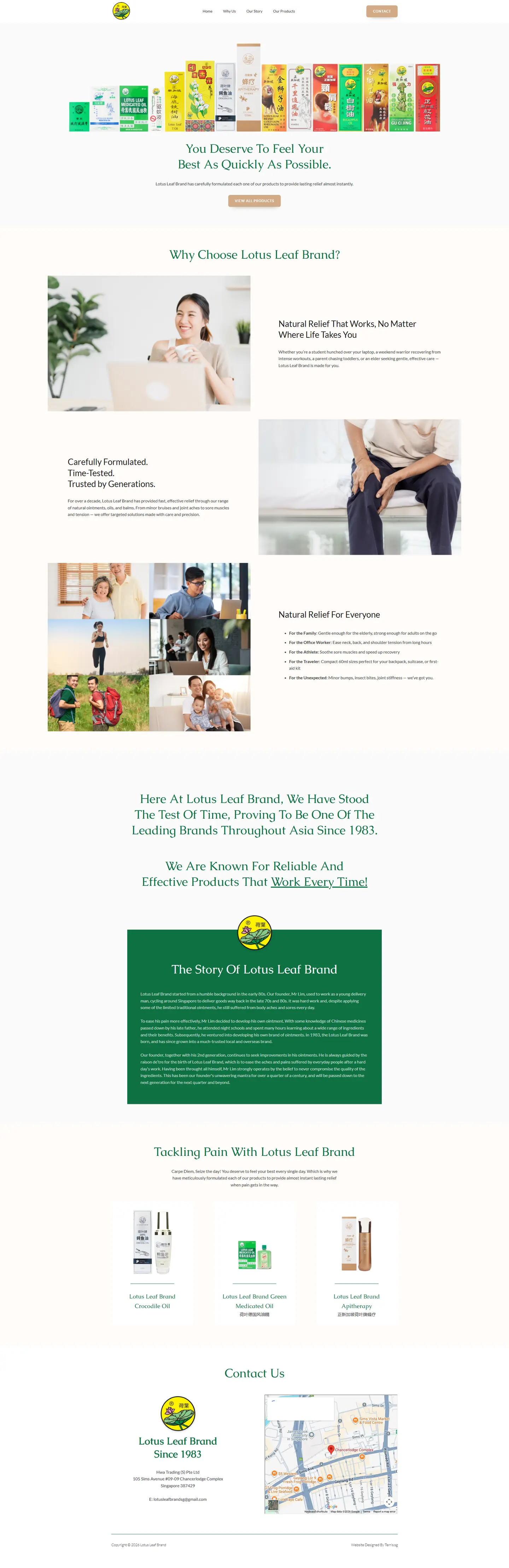
The boxes stand in one row across the top of the page, in their original Chinese and English packaging, with You Deserve To Feel Your Best As Quickly As Possible underneath. A regular customer spots theirs at a glance, and View All Products sits right under the headline.
Before
One bottle, five very different buyers
An older customer with stiff joints, an office worker with a sore neck, an athlete, a parent and a traveller all reach for the same oil for different reasons. A plain product grid speaks to none of them.
What I did
I sorted the range by why people reach for it
Natural Relief For Everyone gives each reason its own line: the family, the office worker, the athlete, the traveller and the unexpected, from minor bumps to insect bites. The traveller's line points to the 60ml sizes that fit a backpack, a suitcase or a first-aid kit.

Before
Nobody had heard how the brand started
Mr Lim learned Chinese medicine from his late father, went to night classes and made his own ointment because nothing he could buy eased the aches from his delivery rounds. It's the most persuasive thing about the brand, and it wasn't written down anywhere a customer could find it.
What I did
I told the founder's story in full
The Story Of Lotus Leaf Brand runs from his delivery rounds in the late 70s, through the night classes, to the founding in 1983, and ends with his second generation working alongside him. Our Story has its own place in the menu.
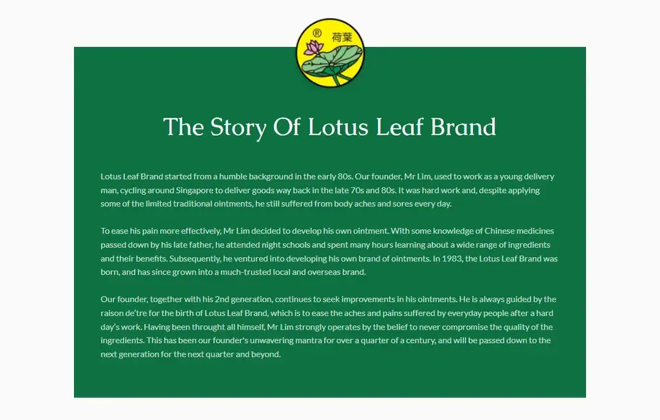
The whole site, desktop and phone
These are captures of the real pages. Open either frame to scroll down the full page.

How the build ran, 3 weeks in all
-
Discovery & Story 4 days
Interviewed the family for the founding story and worked out the five use cases that structure the page.
-
Design 1 week
Developed the restrained green and neutral system, the product line-up treatment and the story layout.
-
Build 1 week
Built the site on WordPress with the product range, the why us and story sections and the contact route.
-
Launch 2 days
Product photography placement, responsive testing and deployment.
Next project
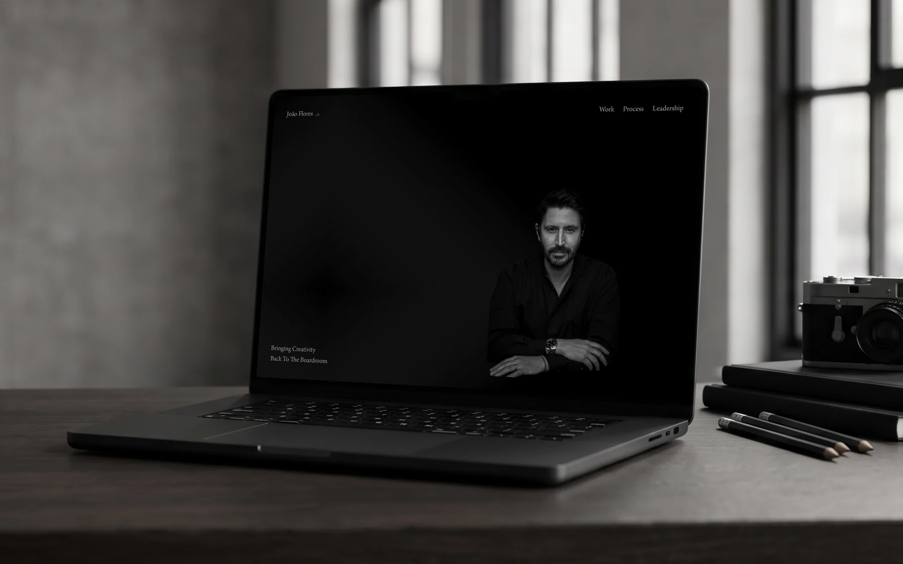
More work like this
-
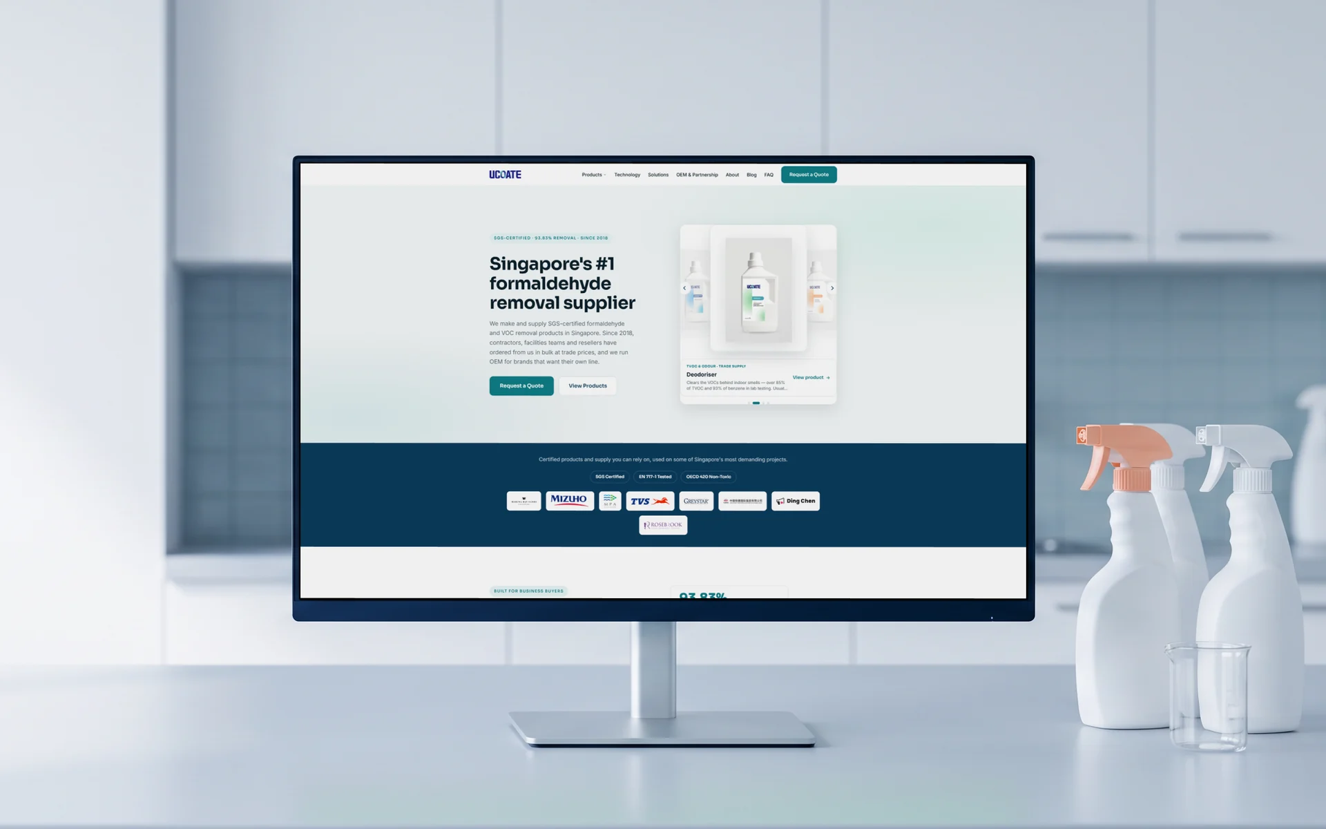
UCOATE
A 60-page rebuild with 42 guides and a separate route for trade and OEM buyers.
Read the case study → -
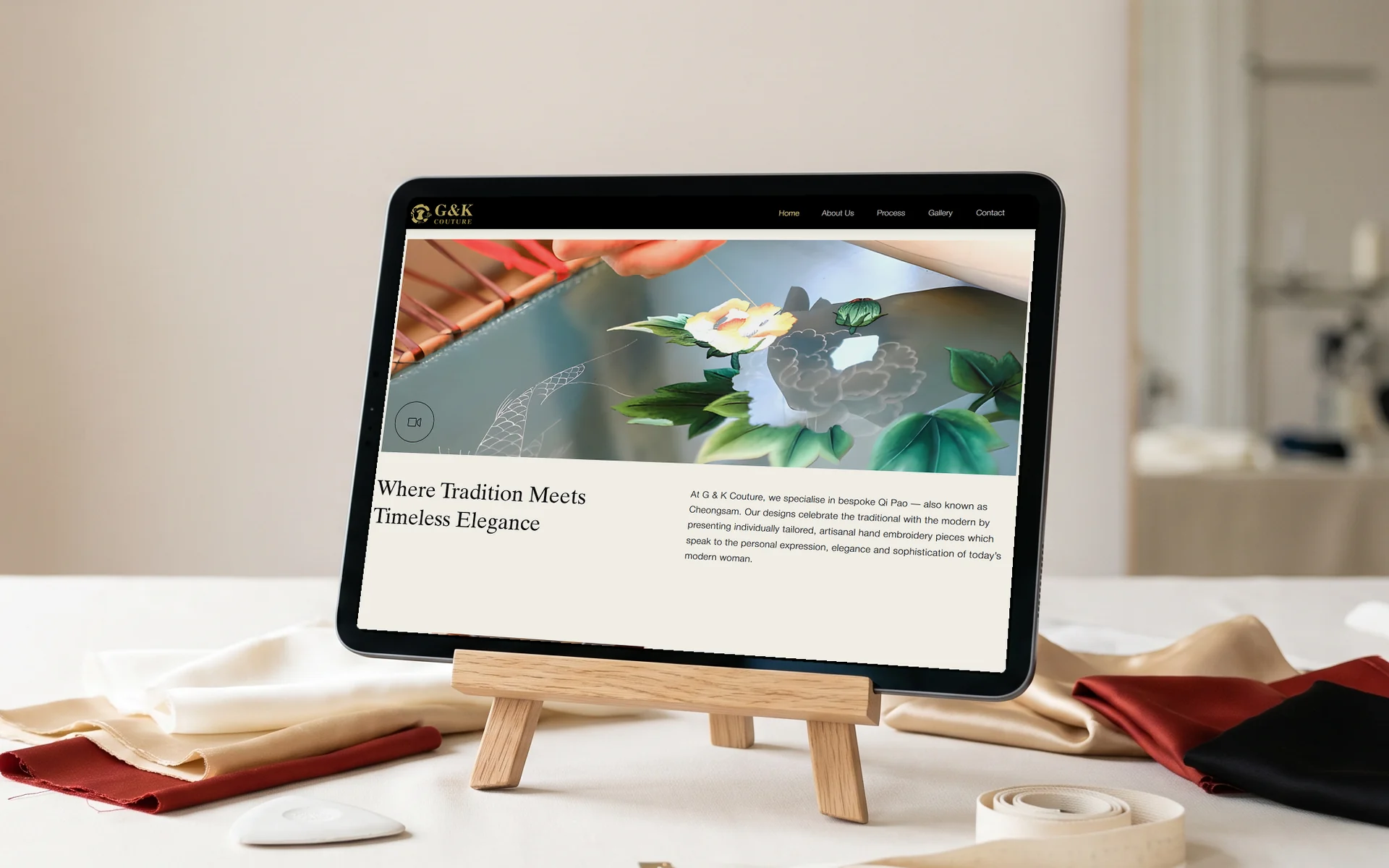
G & K Couture
A cream and gold site for a bespoke cheongsam atelier, with its Google Business Profile set up.
Read the case study → -
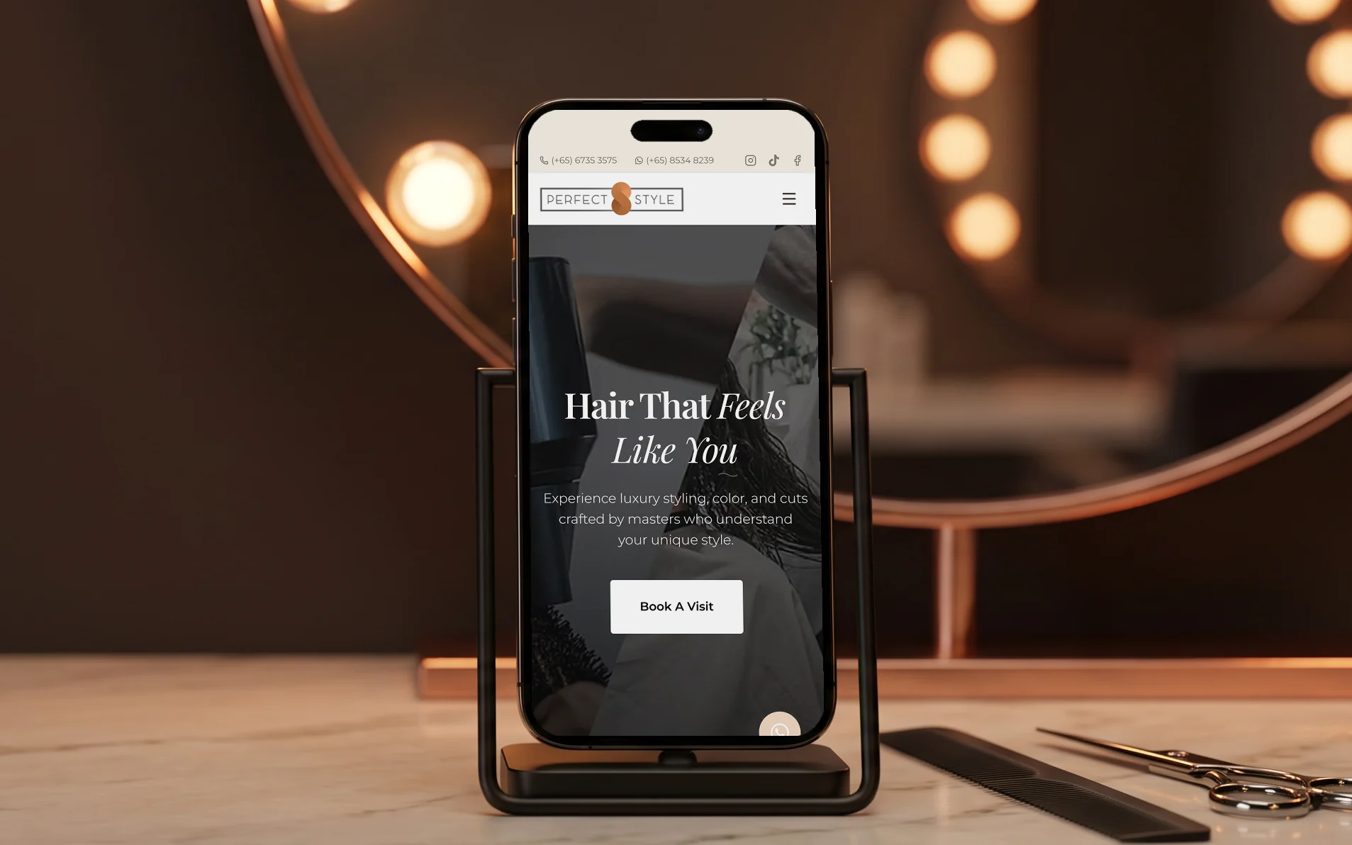
Perfect Style Salon
A redesign for a luxury hair salon, with booking built in and structured data on every page.
Read the case study →
Tell me about your business and I'll show you what I'd build
Message me what you do and what the site needs to do. I'll reply with a fixed price and how long it takes.