

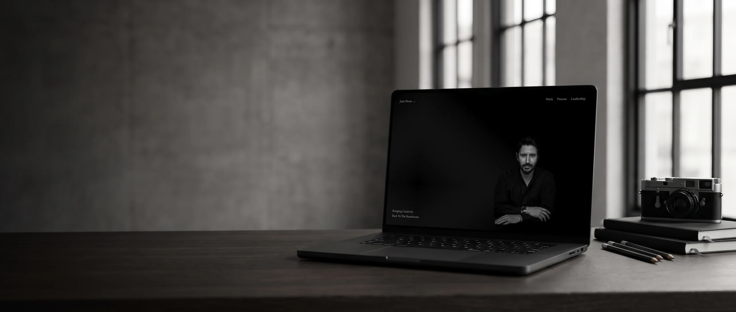
Hi, I'm Terris. I designed and built this site myself, start to finish.
João Flores
João Flores is a creative leader who sells into boardrooms.
The project at a glance
I built four pages in Framer: a single-screen opening statement, a work page of fourteen pieces with no captions, and two short pages of principles. For him, what's left out makes the argument.
- Client
- João Flores
- Industry
- Creative Leadership
- Location
- International
- Built
- 2026
- Time to build
- 2 weeks
- Live site
- joaoflores.com
What I did
Built with
Framer
In numbers
- 4 Pages
- 14 Work Pieces
- 3 Process Principles
Counts from the site I built, and figures the business publishes about itself.
What wasn't working, and how I fixed it
Before
João's buyers judge his website before they read it
He sells creative judgement to boards, so his site is the first piece of work they see. Sites like his tend to over-explain, and a long biography tells a sceptical reader the work can't speak for itself.
What I did
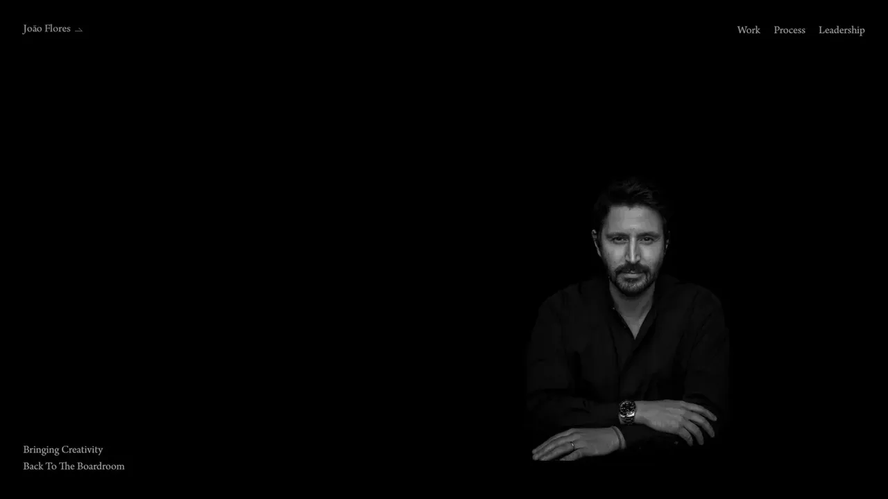
I made the homepage one screen and one sentence
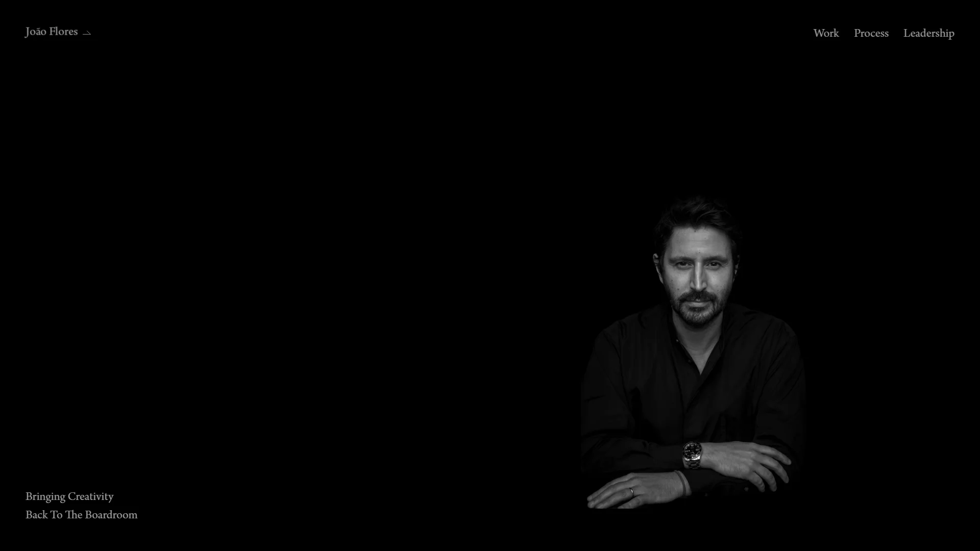
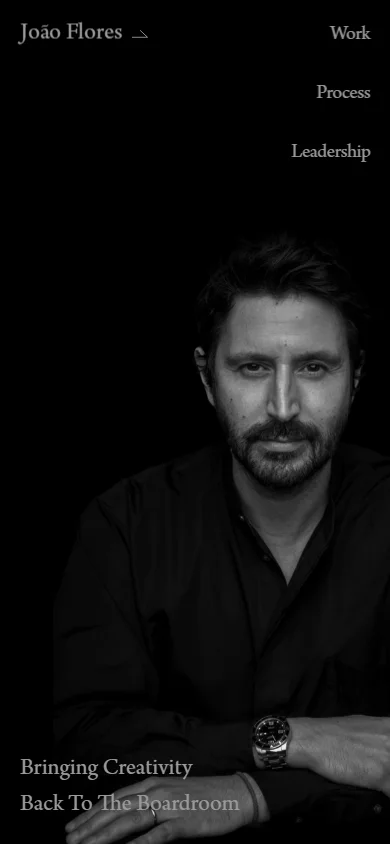
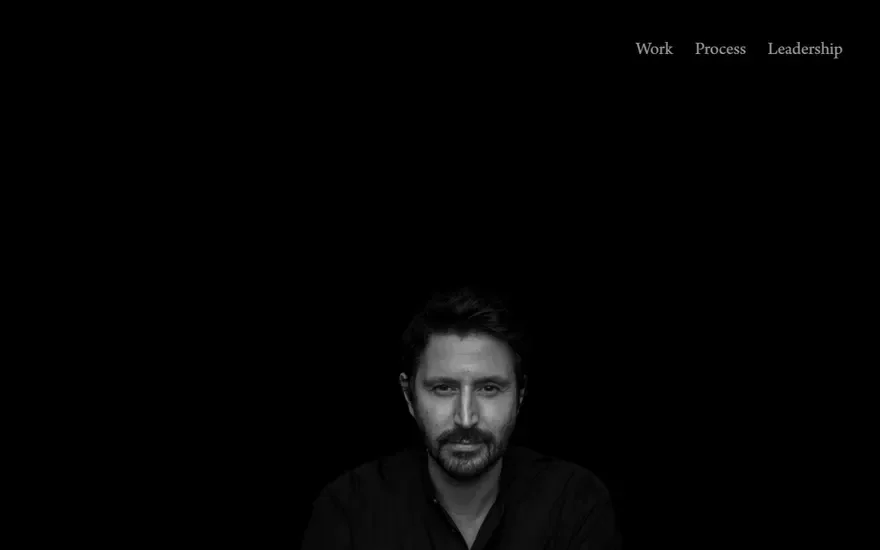
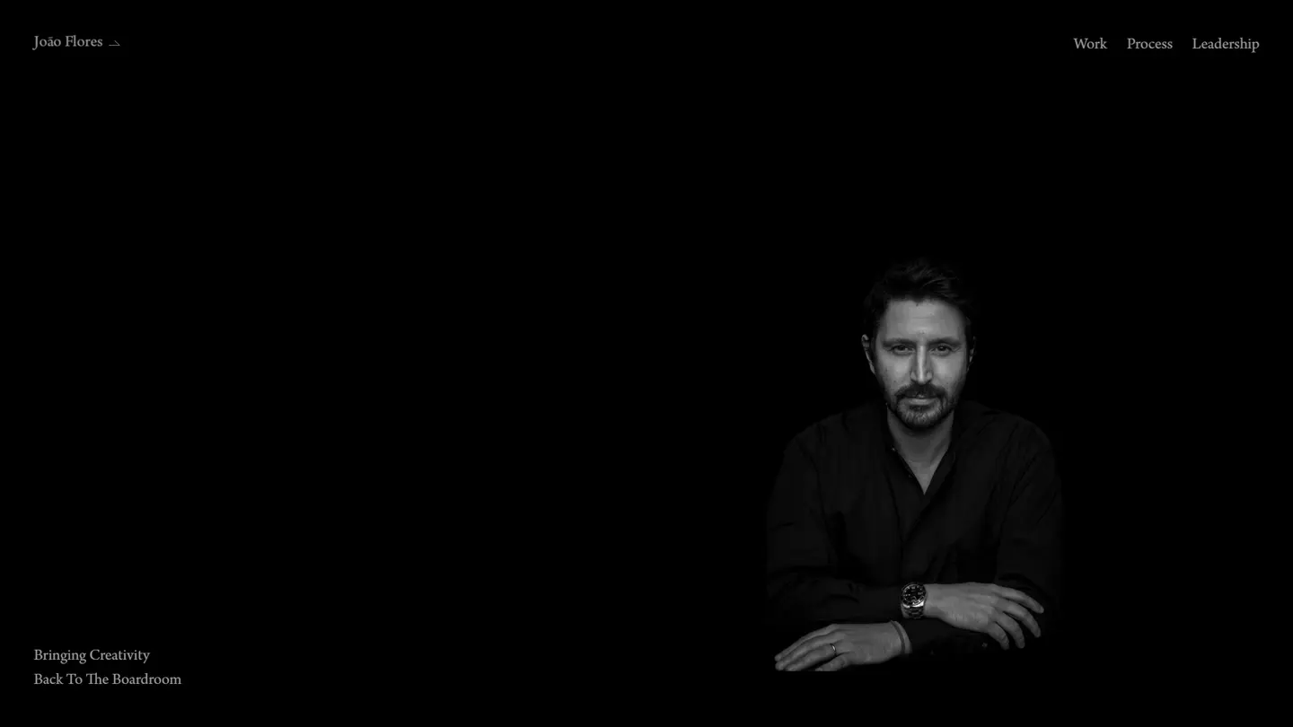
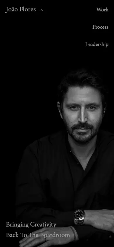
A black-and-white portrait sits on pure black. His name is top left, three menu items are top right, and Bringing Creativity Back To The Boardroom is set small in the bottom corner. Nothing scrolls, and there's no carousel.
Before
Creative peers and boards want opposite things from him
Peers want to see the work with nothing in the way. A board wants a method behind it, and to know he's safe to put in front of them.
What I did
I gave each audience its own page
Work runs fourteen pieces down one long page with no captions or client names. Process gives a board three principles at a line each, Human Craft, Creative Dimensions and Real-Time Hacks. Leadership splits into News, Roar and Biography, so nobody has to read a career history to reach the work.
Before
On four pages with almost no copy, every choice shows
A near-black page with one line of text looks either very confident or unfinished. Which one comes down to the type, and to how much of the portrait the dark is allowed to take.
What I did
I lit the portrait so it comes out of the dark
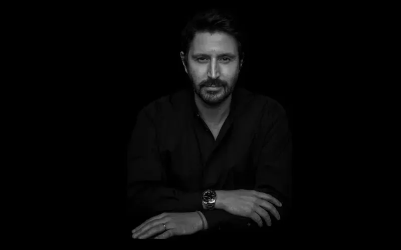
The photo is black and white. His face and hands catch the light and his dark shirt fades into the background. The type is a light serif, set small with room around it, and those two things are the whole design system.
The whole site, desktop and phone
These are captures of the real pages. Open either frame to scroll down the full page.
How the build ran, 2 weeks in all
-
Direction 4 days
Agreed the central decision, that the site would be short and quiet, and worked out what each of the four pages had to carry as a result.
-
Design 1 week
Developed the black-and-white system, the type treatment, the portrait handling and the work page rhythm.
-
Build & Launch 3 days
Built and shipped in Framer, with responsive passes and launch.
Next project
More work like this
-
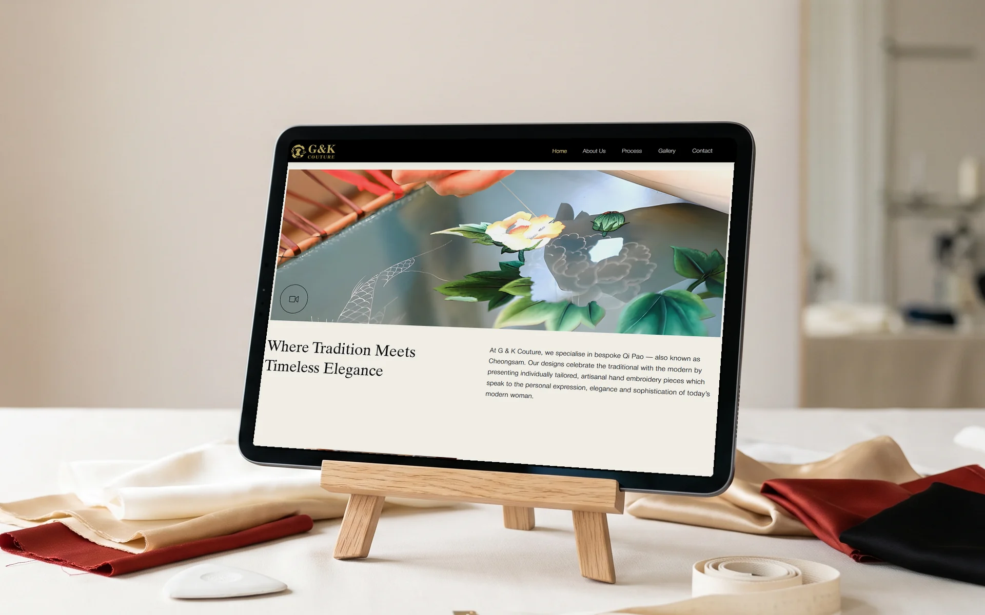
G & K Couture
A cream and gold site for a bespoke cheongsam atelier, with its Google Business Profile set up.
Read the case study → -
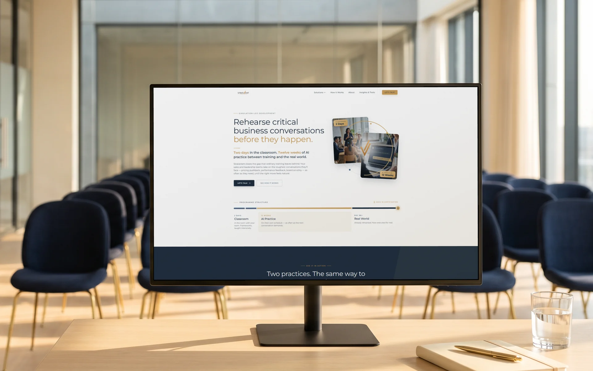
StrataVant Performance
A corporate training site where two AI roleplay demos play out on the homepage.
Read the case study → -
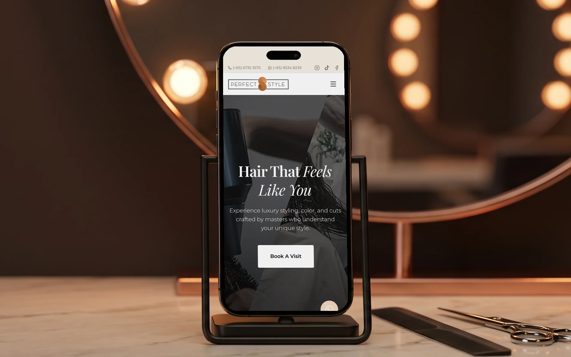
Perfect Style Salon
A redesign for a luxury hair salon, with booking built in and structured data on every page.
Read the case study →
Tell me about your business and I'll show you what I'd build
Message me what you do and what the site needs to do. I'll reply with a fixed price and how long it takes.