

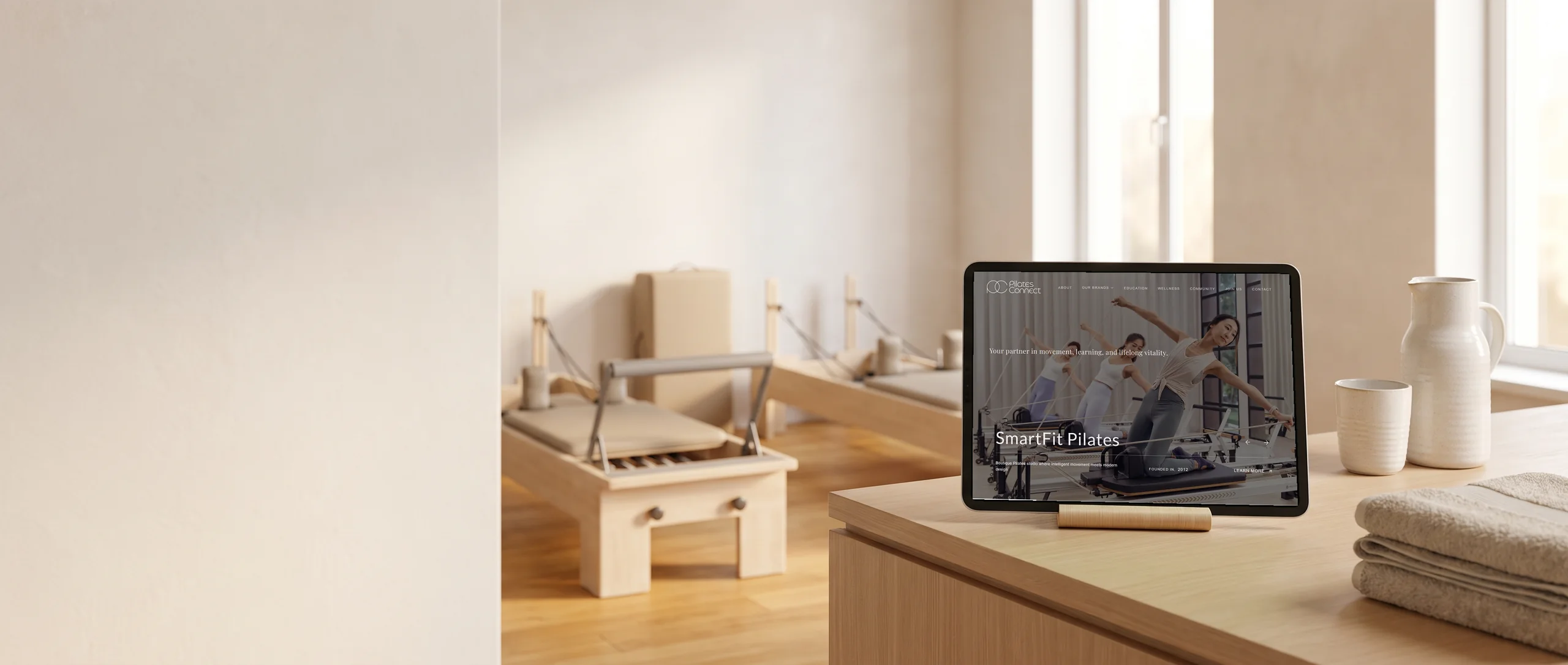
Hi, I'm Terris. I designed this concept myself, to show what the site could be.
Pilates Connect is the parent company of five Pilates and wellness brands, from The Moving Body to FitNut Loft. This is a design concept, not a launched client site.
The project at a glance
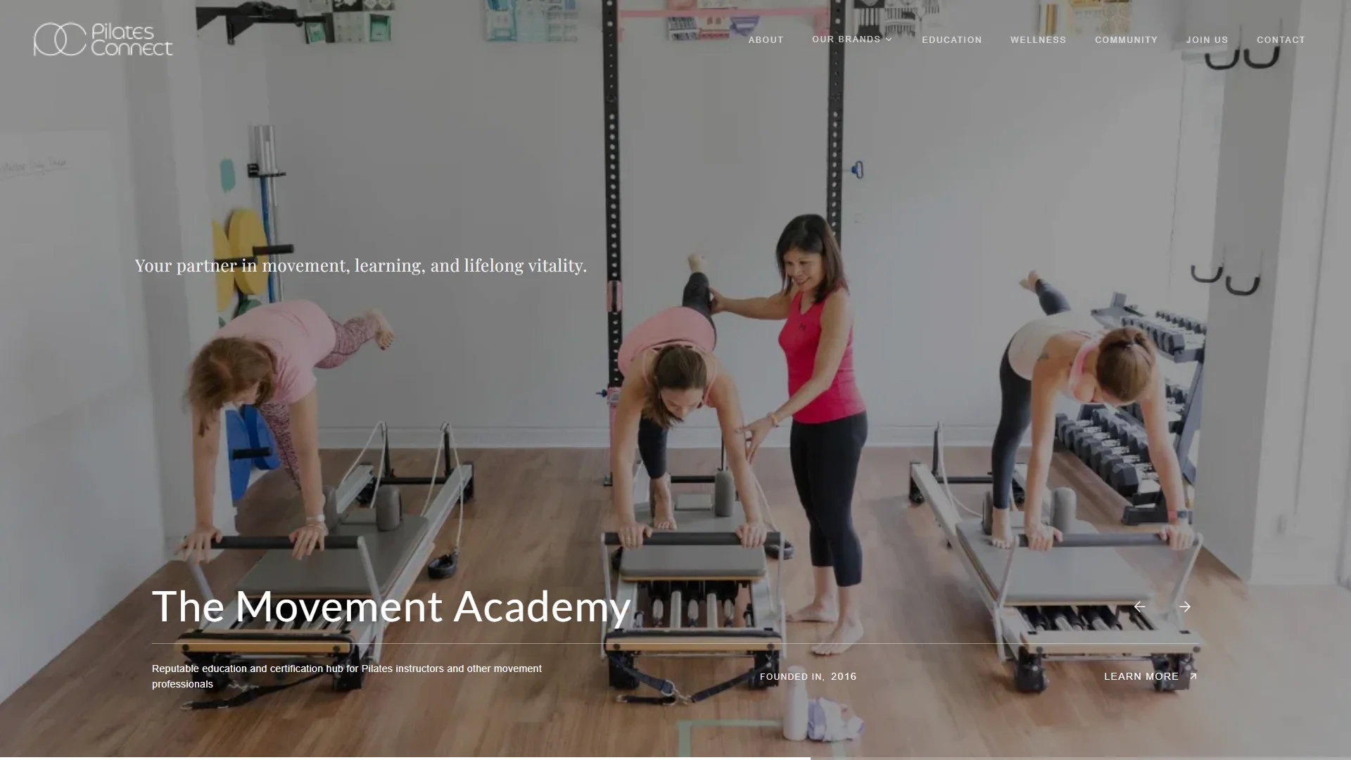
I designed the homepage as a front door to all five. A full-screen carousel gives every brand its own slide, founding year and link, and the group's philosophy sits underneath.
- Designed for
- Multi-Brand Pilates Group
- Industry
- Pilates & Wellness
- Location
- Singapore
- Designed
- October 2026
- Time to design
- 1 week
- Status
- Design concept, not a launched site
What I did
Built with
Next.js, React, Tailwind CSS
What Pilates Connect needs, and how the design answers it
Today
Most visitors want one studio, and the group runs five brands
The Moving Body runs Pilates and Gyrotonic studios, The Movement Academy certifies instructors and FitNut Loft trains women in their 40s and over. Someone looking for one of them needs to find it in a few seconds.
What the design does
The design gives every brand a turn in the hero
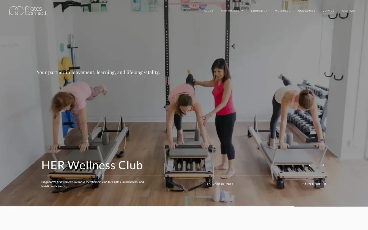
The first screen shows one brand at a time on a full-width photo. Here it's HER Wellness Club, with a line on what it is, Founded In 2024 and Learn More along the bottom, and arrows to the next. The group's line, Your partner in movement, learning, and lifelong vitality, stays put above every slide.
Today
The group's history is split across five brand names
The Moving Body opened in 2009 and HER Wellness Club in 2024. Met one at a time, the brands don't show a group that's been building since 2009, and a new visitor could take it for a fresh franchise.
What the design does
The design lines the five brands up together
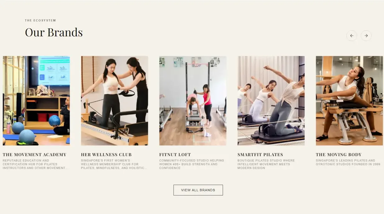
The Our Brands rail gives each brand a photo card and a short line, from The Movement Academy to The Moving Body, Singapore's leading Pilates and Gyrotonic studios founded in 2009. Arrows move it along and View All Brands sits underneath. Each slide in the hero carries its brand's founding year too.
Today
Pilates sits somewhere between a gym and a clinic
These are boutique studios, and the group site speaks for five of them at once. It has to feel personal, closer to a small studio than a gym chain.
What the design does
I set it in a quiet serif, on white and warm stone
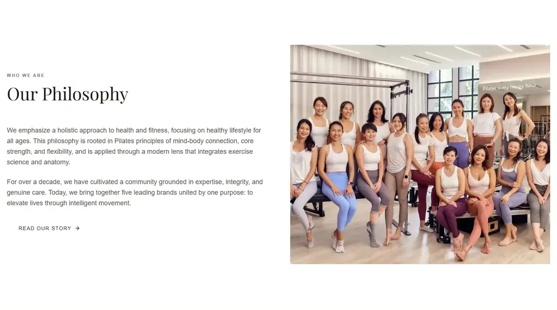
Our Philosophy shows the pattern: a small tracked label over a high-contrast serif heading, two short paragraphs and Read Our Story, beside a photo of a class in the studio. The brand rail below sits on warm stone, and the page closes on a charcoal footer.
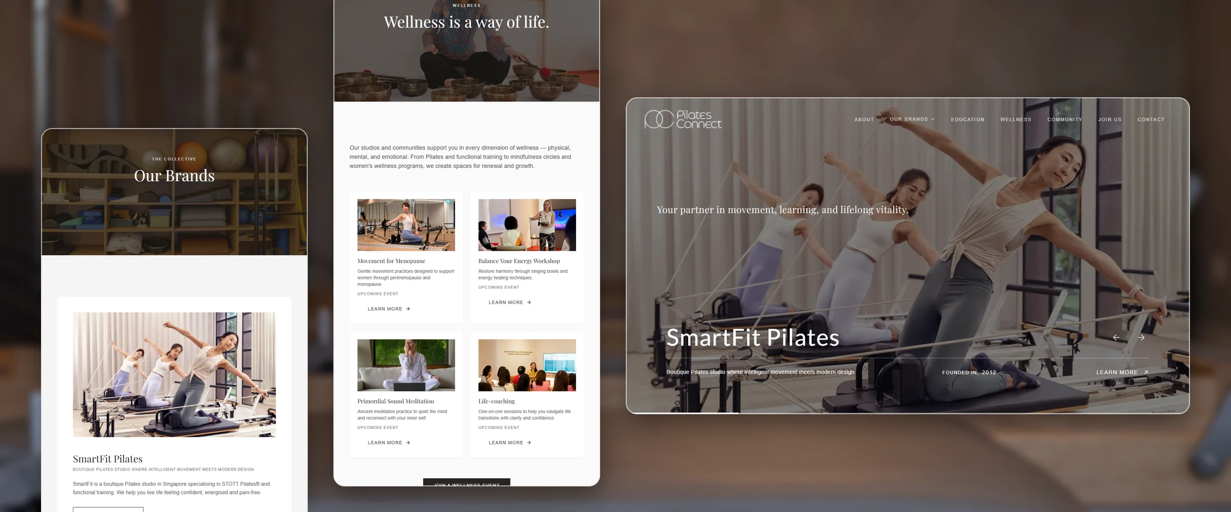
The same care on every page
The Our Brands and Wellness pages beside the homepage, captured from the concept.
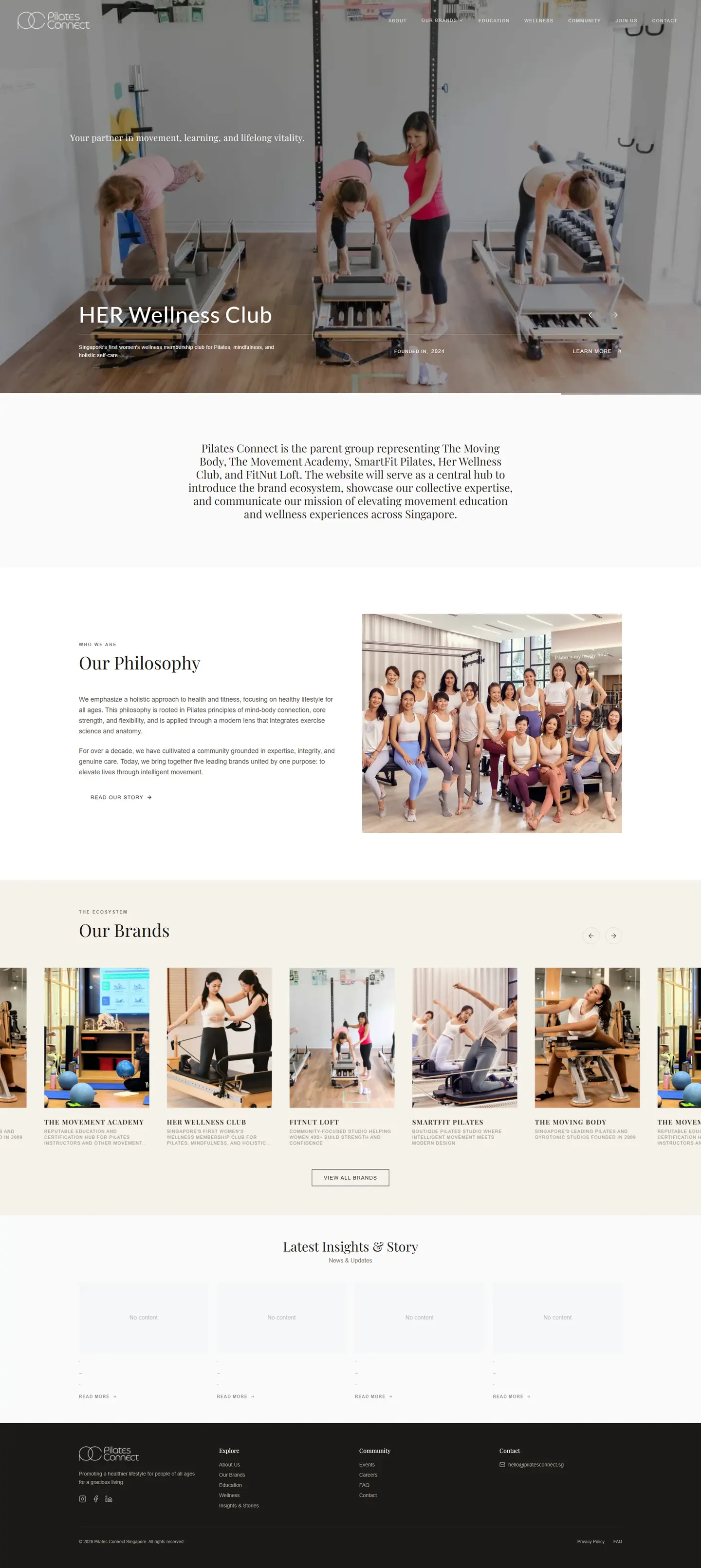
The whole concept, desktop and phone
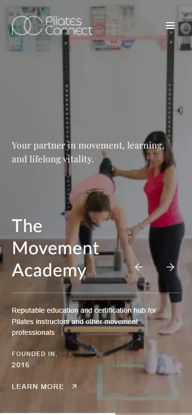
These are full captures of the concept. Open either frame to scroll down the whole page.

Next project

More work like this
-
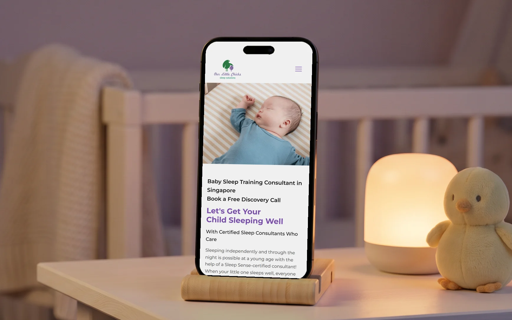
Our Little Chicks
A baby sleep consultancy site written for a parent reading it at 3am.
Read the case study → -
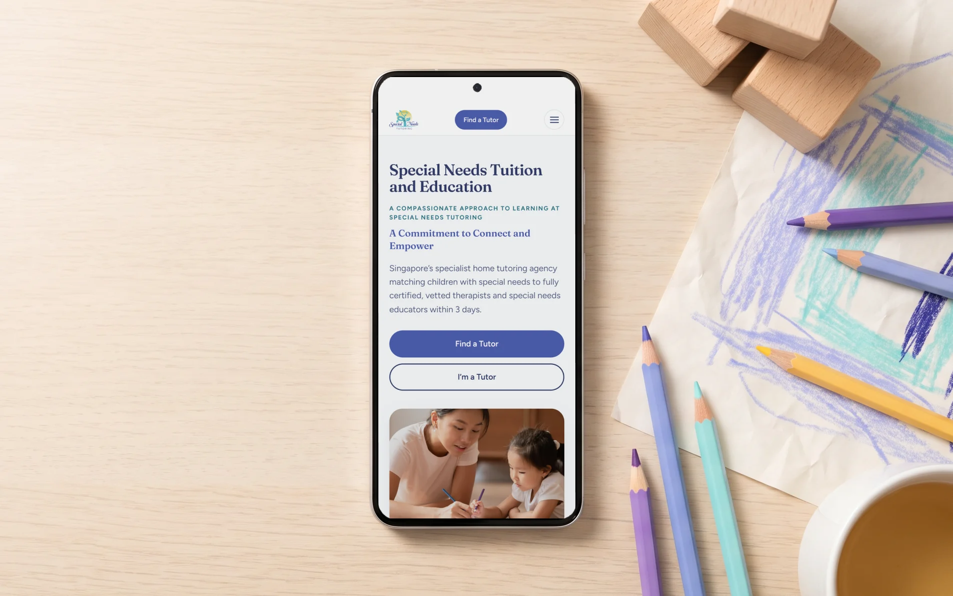
Special Needs Tutoring
A 38-page site for a special needs agency, from the brand up, with a page for each of 14 conditions.
Read the case study → -
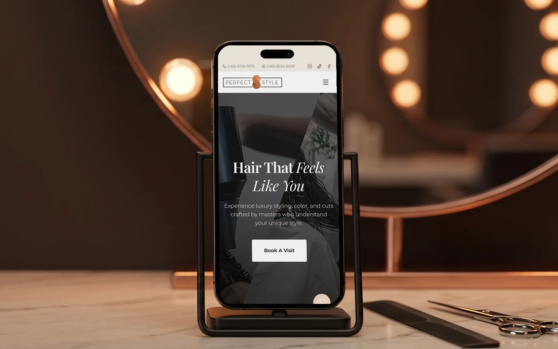
Perfect Style Salon
A redesign for a luxury hair salon, with booking built in and structured data on every page.
Read the case study →
Tell me about your business and I'll show you what I'd build
Message me what you do and what the site needs to do. I'll reply with a fixed price and how long it takes.